Incipia blog
Google Play Store ASO Screenshot Examples
Looking for ideas on how to update your screenshots for the Google Play Store? Check out this list of screenshots taken from across the Google Play Store, along with minimal commentary.
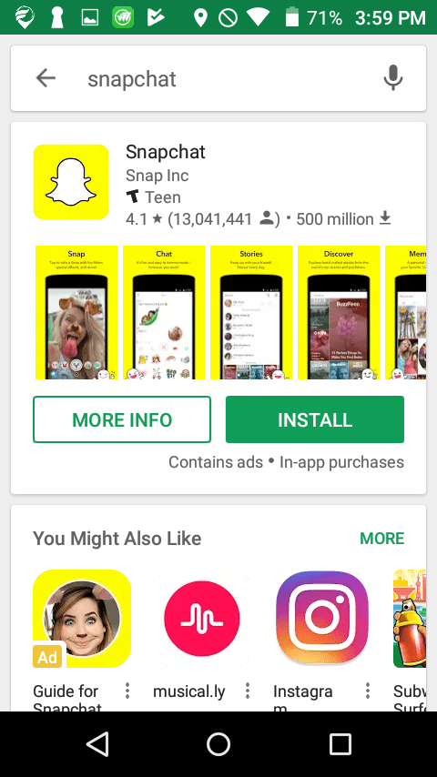
Before diving into the comparison of screenshots styles, it's important to consider two important facts about the Google Play screenshot asset:
- Google Play screenshots, unlike their App Store counterparts, occupy a low level on the visibility totem pole. Before a user sees a Google Play app's screenshots, the user must first tap the app preview, where the icon is the first visual element. Then, the user must scroll down below the (past the feature graphic/video and the short description), to reach the screenshots.
- Google Play screenshots, therefore, do not need to capture a user's attention; instead, the main focus should be on educating the user on what the app does, and why they should care. In this regard, custom design is less important for Google Play screenshots, and may even backfire.
One caveat is that, for larger branded apps screenshots will show in search results.
Custom Background Google Play Screenshots
Custom background screenshot styles are one of the more safe styles of design, allowing the app to be creative, while also introducing minimal risk into obscuring the screenshots themselves. The third screenshot here of Checkout 51 is the exception, opting for a much busier background along with call out and pop off elements, the confluence of which creates a high risk of overwhelming users who are simply looking to know what the app looks like.
Alternating Design Google Play Screenshots
As an attention-capturing device, alternating the design or style of each screenshot does a good job, yet it also makes screenshots appear busier and less cohesive, which can strike the wrong cord with an apps' branding feel. Additionally, given that the purpose of Google Play screenshots is less necessary to capture attention, this style of design can introduce more risk to converting users than benefit.
Connected-Style Google Play Screenshots
Connecting screenshots together is a common approach in ASO for the ability to control the messaging with a larger surface area for text, and also allowing for more design creativity. The downside is the flip-side of this coin, meaning that it may put users on alert about being "advertised to" more-so than more "standard" designs, by reducing the number of screenshots available for users to see, and ultimately reducing their confidence in objectively deciding whether the app solves their needs.
Story-Style Google Play Screenshots
Zillow takes an innovative approach by using landscape screenshots to tap into a larger surface area per screenshot; thus Zillow is able to execute a story-style screenshot design, with longer captions that don't also require a sacrifice in legibility. Zillow also uses a different icon to accentuate the main message in each screenshot, and a gradient to add a polished touch.
Over-Designed Style Google Play Screenshots
As the name implies, this screenshot style is hardly a set of screenshots. In each set, there is only one clear screenshot in a device profile, with the other screenshots going overboard with design. While certainly eye-catching, this screenshot style is also extremely busy and thus more likely to turn users off than explaining why the app in a clear and concise manner.
Pop-Off UI Google Play Screenshots
Popping UI elements off of the screen is a nice way to subtly call attention to specific components of the app and direct the user's focus to key messaging or value, and as such is well-suited to Google Play screenshots. That said, popping UI elements off of the screen runs the risk of obscuring other screen elements or making a screen that has several other important UI elements more confusing for users to understand.
Standard Caption Google Play Screenshots
Using a standard caption that contrasts enough against the font to make it clearly legible is a safe and common approach to both educate users and also allow the screenshots to explain the purpose and value of the app.
That's all for now, folks! Be sure to bookmark our blog, sign up to our email newsletter for new post updates and reach out if you're interested in working with us.
Incipia is a mobile app development and marketing agency that builds and markets apps for companies, with a specialty in high-quality, stable app development and keyword-based marketing strategy, such as App Store Optimization and Apple Search Ads. For post topics, feedback or business inquiries please contact us, or send an inquiry to hello@incipia.co.
Categories
Tags:
- A/B testing
- adjust
- advertising
- adwords
- agile
- analytics
- android development
- app analytics
- app annie
- app development
- app marketing
- app promotion
- app review
- app store
- app store algorithm update
- app store optimization
- app store search ads
- appboy
- apple
- apple search ads
- appsee
- appsflyer
- apptamin
- apptweak
- aso
- aso tools
- attribution
- client management
- coming soon
- design
- development
- facebook ads
- firebase
- google play
- google play algorithm update
- google play aso
- google play console
- google play optimization
- google play store
- google play store aso
- google play store optimization
- google uac
- google universal campaigns
- idfa
- ios
- ios 11
- ios 11 aso
- ios 14
- ios development
- iot
- itunes connect
- limit ad tracking
- ltv
- mobiel marketing
- mobile action
- mobile analytics
- mobile marketing
- monetization
- mvp
- play store
- promoted iap
- promoted in app purchases
- push notifications
- SDKs
- search ads
- SEO
- skadnetwork
- splitmetrics
- startups
- swift
- tiktok
- uac
- universal app campaigns
- universal campaigns
- user retention
- ux
- ux design
