Incipia blog
The Proven Method for Doubling App Conversion Rate on App Store Pages
This is a guest post by A/B testing firm, SplitMetrics, on improving your app's app page download conversion rate.
Dozens of new apps debut on Google Play and App Store every day, stirring up intense competition. With average conversion rates of 26%, publishers fight for each and every user, especially in the most competitive store categories, such as games (average conversion is less than 5%).
Yet, there ain't any straightforward tactics or a magic conversion app that instantly boost results. It’s always tempting to give up and grumble that conversion rate is beyond your control, though this approach will lead you nowhere or worse, to the bottom of app store food chain. Instead, publishers and developers should be proactive and take control of the situation. You can double your app conversion rate, providing you’re ready to take decisive actions.
The following is a sure-fire strategy, which will trigger conversions growth of your app’s product page, and consists just of 3 steps:
- Research, analysis, and brainstorming.
- Running A/B experiments.
- Implementation of ideas that boost conversions.
Step 1: Research, Analysis, and Brainstorming
Every task may seem extensive and insurmountable at the beginning, especially when such words as research and analysis come into play. That said, there are a list of activities that will result in a profound understanding of your store page needs and essential next actions.
Indicate product page sore points.
It’s time to turn on your inner critic. Examine your app’s store page and take an account of all of its questionable and crude elements. If you find flaws in them, these elements are definitely worth testing.
Explore product pages of your competitors.
This is not about cloning somebody’s icon design or description. Peers analysis assists in identifying best practices that can be applied and customized when optimizing your store page.
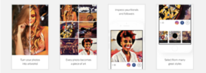
For instance, Prisma which earned title of “the App of 2016,” identified the following screenshots best practices via analyzing competitors:
- Publishers tend to put captioned text on the top of their screenshots.
- It’s preferable to use fairly bold font in the text of screenshots and dial up the contrast.
- It’s necessary to eliminate repetition from caption text, allowing the focus to remain on the features.
- Adding comments and likes to your screenshots evokes positive dynamics.
- It’s vital to use all 5 screenshots.
These ideas were turned into hypotheses for further A/B tests. Here’s original set of Prisma screenshots:
Source: SplitMetrics
And here are redesigned screenshots, which resulted in 12.3% conversion increase.
Source: SplitMetrics
Study core metrics and trends of your category.
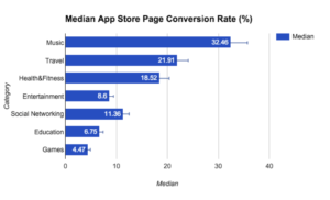
Above all, find out an average conversion rate to use as a benchmark, since this data will be used in your tests as a reference point and guideline.
Source: https://splitmetrics.com/blog/whats-a-good-app-store-page-conversion-rate/
Conversion rates differ dramatically from category to category. Thus, it makes no sense to be guided by, say a music app conversion rate when optimizing a game.
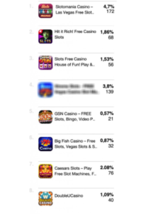
You can also identify performance of your rivals thanks to category split-tests. For example, a slots app publisher ran such a test against some category competitors, and found out that ranking lower doesn’t always mean having worse conversion rate:
Source: https://splitmetrics.com/blog/how-to-run-category-tests/
Define consistent patterns in your analytics.
Probe into data on traffic sources, marketing performance across channels, ads campaigns, banners layout, etc. to try to reveal trends, and draw conclusions based on these metrics.
Brainstorming.
Here I refer not only to classic team or individual ideas pitched within a meeting. Be creative and venturous, go out of the office, for instance, hold a brainstorming picnic!
Don’t be shy to ask your friends, family or maybe even perfect strangers at a local coffee shop to comment on your app’s product page. You can also try to collect ideas via surveys or social networks. It’s important to keep a record of all suggestions.
Organize an internal company hackathon.
Designers can compete to create various layouts for screenshots and icons, the marketing content team can come up with new variants of short descriptions and titles, and so on.
You’ll undoubtedly get a plenty of ideas for testing as a result of all these activities. You can get down to the next step once the list of hypotheses to be checked is ready.
Step 2. Running A/B Experiments
Doubling your app's conversion rate is hard to achieve without extensive testing; but it’s vital to understand core principles behind successful A/B experiments before launching them:
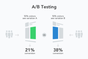
- App A/B testing or split-testing is a means of comparing two or more store page element versions, identifying the best performing variant, and analyzing results.
- An audience should be unaware of the participation in testing.
- Every test starts with research and analysis. Consult the App Store optimization guide to find room for improvements.
- Each variation should represent only one hypothesis to allow a clear impact to be determined.
- When choosing a traffic source, it makes sense to opt for ads networks that provide wide range of targeting options (eg: Facebook ads).
- It’s essential to distribute targeted users randomly and equally among each tested variation, using such services as SplitMetrics automate this process.
- It’ preferable to run a test for 7 days to fix users behavior on every day of the week.
- Results are acknowledged as credible solely after filling an experiment with a statistically significant number of active users. This number is influenced by your actual conversion rate; the lower your conversion rate, the more users you will need.
Source: https://splitmetrics.com/resources/what-is-ab-testing-and-why-it-matters-for-mobile-developers/
Thanks to the first step, you’ll have enough hypotheses to run a series of A/B tests. Afterwards, it will be necessary to prepare layouts for product page elements in the test. Keep in mind that new designs should reflect assumptions collected during the process of research, analysis, and brainstorming.
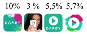
The publishers of the app, Darby, decided to test various trends reflecting each in a separate icon. They tested a simpler and sleeker concept, a branded icon with a prominent name, and the one featuring a photograph, all against their original icon. The test results clearly proved that their branded icon was the best performing icon of the bunch.
Each app store page element affects conversion, there’s no denying that. Nevertheless, screenshots have to be the most important page element with regard to impacting users’ decision-making process. So, it’s a good idea to start your conversion rate optimization process by playing around new screenshot designs.
When launching a split-test, it’s highly recommended to use specialized platforms to minimize any testing drawbacks and speed the process via automatization. Moreover, some tools (eg: SplitMetrics) offer pre-launch experiments which allow you to maximize your product page potential conversion before your app is live in the store.
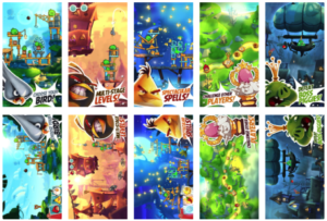
For instance, Rovio ran a series of pre-launch experiments for Angry Birds 2, testing the impact of portrait vs landscape screenshots, using different characters, various captions, etc. This A/B testing activity generated 2.5M more installs in just a week after the release of the app.
Source: https://splitmetrics.com/blog/angry-birds-2-as-a-case-study-for-aso-and-ab-testing/
Step 3: Implement ideas that boost conversions
It’s critical to take time for a thorough analysis of app A/B testing results. Every publisher should understand that you have to play the cards of experiment results well, in order to double app conversion rate.
Here are several ground rules on distilling the most intelligent and action-oriented results:
- A result is trustworthy only upon reaching a decent confidence level (at least 90%).
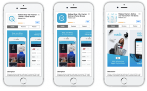
- Even negative results are still great results, as they immunize you against careless decisions concerning your product page. For example, a non-retailer shopping app Mallzee tested their icon and found out that new design was 14% less effective than the original. Thus, the company was able to prevent a disastrous drop in their App Store conversion rate.
Source: https://splitmetrics.com/blog/app-ab-testing-negative-results/
- Conversion rate is highly important, but it’s worth paying attention to other metrics such as time on page, interactions with different elements of your app’s page (screenshots, descriptions, etc.), scroll depth, etc.
- Results should be used for ascertaining audience behavioral patterns.
- The majority of your hypotheses won’t be proved, but it’s better to test in the course of an A/B experiment, rather than testing your hypothesis straight in the App Store and risking adverse results that affect your entire userbase.
- Testing individual changes independently assists in identifying the ones that trigger a conversion boost. Later you can unite elements with the best performance, polishing your app store assets gradually.
Providing that you find a clear winner, you can implement the results in the App Store. Yet, it’s crucial to turn A/B testing into an essential part of your ASO strategy. The truth is that app stores are ever-changing systems subject to constant alterations. Thus, it’s critically important to continually run follow-up experiments to scale results.
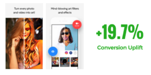
For example, Prisma continued testing after the success of their initial experiments. The company launched more screenshots tests and experimented with their description, which resulted in an additional growth of 19.7% in their app’s conversion rate.
Source: https://splitmetrics.com/blog/prisma-how-we-ab-tested-and-optimized-2016s-app-of-the-year/
There’s no magic pill that is capable of skyrocketing your conversion rate overnight. However, it’s possible to at least double this metric by means of smart research and systematic A/B testing. It takes hard work and dedication, but earning impressive performance in the end for your app will make it well worth the effort.
Splitmetrics is mobile platform that helps app marketers and developers to mobile marketers to A/B test and optimize iOS and Android app store pages for maximum conversion.
Categories
Tags:
- A/B testing
- adjust
- advertising
- adwords
- agile
- analytics
- android development
- app analytics
- app annie
- app development
- app marketing
- app promotion
- app review
- app store
- app store algorithm update
- app store optimization
- app store search ads
- appboy
- apple
- apple search ads
- appsee
- appsflyer
- apptamin
- apptweak
- aso
- aso tools
- attribution
- client management
- coming soon
- design
- development
- facebook ads
- firebase
- google play
- google play algorithm update
- google play aso
- google play console
- google play optimization
- google play store
- google play store aso
- google play store optimization
- google uac
- google universal campaigns
- idfa
- ios
- ios 11
- ios 11 aso
- ios 14
- ios development
- iot
- itunes connect
- limit ad tracking
- ltv
- mobiel marketing
- mobile action
- mobile analytics
- mobile marketing
- monetization
- mvp
- play store
- promoted iap
- promoted in app purchases
- push notifications
- SDKs
- search ads
- SEO
- skadnetwork
- splitmetrics
- startups
- swift
- tiktok
- uac
- universal app campaigns
- universal campaigns
- user retention
- ux
- ux design
