Incipia blog
Hidden App Store: 5 Tips to Boost Your Organic Installs
This guest post is written by Liza Knotko. Liza is a Сontent Marketing Manager at SplitMetrics, an A/B testing platform trusted by Google, Rovio, Reddit and many others. SplitMetrics helps mobile app developers and publishers hack app store optimization by running A/B experiments and analyzing results.
With almost 2 million available apps in the App Store and ever-intensifying competition, it’s barely possible to conquer this platform without the support of paid acquisition. Nevertheless, it’s hard to find a publisher who doesn’t want to crack the code to maximizing organic installs.
Sure, organic traffic is a shadow side of analytics but A/B tests may provide you with insights into user behaviour on store product pages and their reaction to different app page elements.
The team of SplitMetrics, an A/B testing platform which tracked more than 60 million users, analyzed the latest App Store optimization trends and prepared the list of tips which can help you boost organic installs.
Prioritize Optimization of the First Screenshots
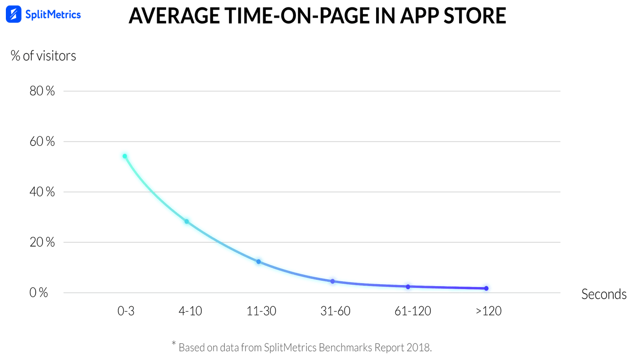
Creating a favourable first impression should become your top priority. Less than 40% of app product page visitors stay there for longer than 3 seconds. This short time span is all you have to raise users interest.
If you succeed in it and App Store visitors don’t leave your page, they are likely to stay for 9 seconds more as 12 seconds is the average time on page for users who don’t leave it within the first 3 seconds.
These humble time slots prove once again that app publishers should focus on optimizing the first horizontal screenshot (2 vertical ones) or video app preview if they have any.
It’s useless to hope that users will appreciate how all screenshots complement each other as only 9% of app store visitors scroll beyond the second image.
Check if You Really Need App Previews
According to the above-mentioned ‘time on page’ metrics, if your product page contains a video app preview, it will be the only element that users check out.
On average, videos are watched for no longer than 11 seconds. Considering that the majority of App Store visitors leave your page within 3 seconds, it’s very unlikely that the first shots of your app preview will convince them of anything.
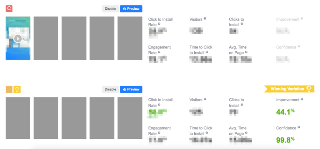
The overwhelming majority of A/B tests prove that App Store pages with no videos perform better at the moment. App preview was always one of the trickiest elements of store product pages and now its necessity is even more questionable.
So spare time to make sure that you really need an app preview on your product page before investing time and money in creating it. Furthermore, don’t be afraid to delete it if experiments show that this product page element deteriorates your conversion rate.
Revise Your Subtitles
After the introduction of subtitles within iOS 11, there was a trend to use call-to-action in them, аnd for good reason. In general, CTAs had a power to improve a conversion rate by 15-20%. However, the rules changed, this product page element can no longer be qualified as novelty and calls for a different approach.
SplitMetrics latest experiments show that CTAs no longer favor conversion growth. What really matters now is an efficient way of reflecting app’s essence with help of this short text. We’ve seen how even slightest subtitle rephrasing resulted in up to 23% CR increase.
What helps to improve subtitles efficiency then?
Above all you should get rid of CTAs and over-complicated phrases (this includes too technical words as well as lofty word combinations). The more concise your subtitle, the greater are the chances of conversion growth.
Another aspect you should consider carefully is the usage of keywords. It’s really important to strike a balance between vital keywords implementation and overall impression your subtitle makes. It’s great when you can add important keywords seamlessly but there are cases when it’s worth sacrificing it for the sake of better conversion.
So it’s definitely worth trying to rephrase your CTA subtitle and test it. For instance, if you have a match three game, it’s better to opt for subtitles like ‘Match 3 puzzle’ instead of ‘Tap and Blast Bubbles’. Here is another example for a hidden object game - ‘Unravel Hidden Mystery’ can be replaced with ‘Hidden Object Mystery’ or ‘Hidden Object Adventure’.
Yet, keep in mind that there’s no golden scheme which will ensure success of your subtitles. Every app, category, and positioning predetermines the style you should use. What works for one game or app can doom another.
Make Screenshots Simplicity Your Forte
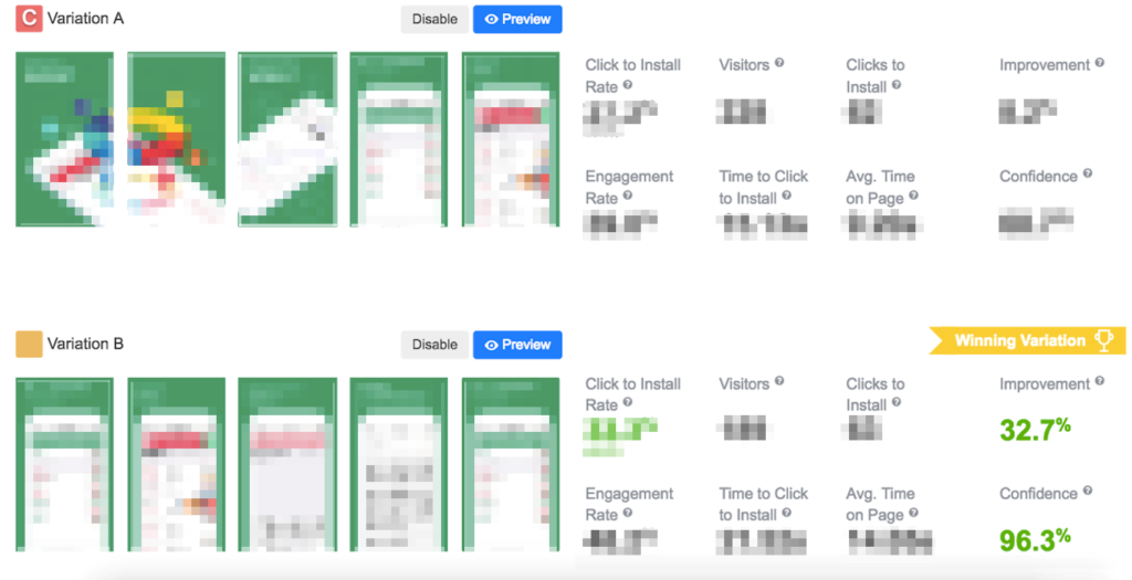
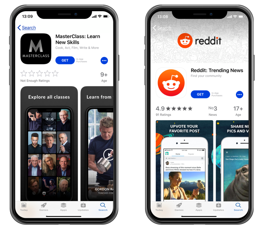
The majority of experiments show that split-screenshots are the matter of the past and normally perform worse than simple screens depicting a device. Another curious observation - customization of screenshots barely makes a difference.
Surprisingly, simple screenshots of app UI with highlighted features run the “conversion ball” at the moment. So try to put exquisite designs aside for a little while and experiment with neat straightforward images which showcase your app.
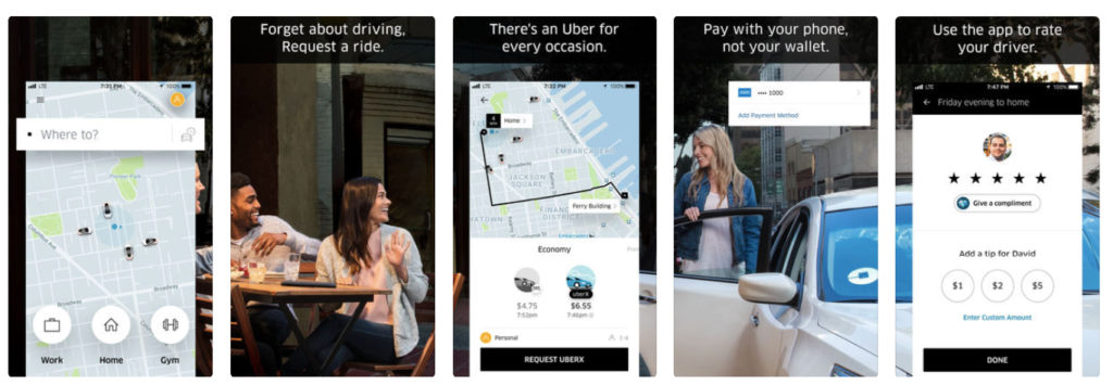
Nevertheless, there’s another way but it’s pretty controversial. You can try to follow Uber footsteps and create a set of feature-based screenshots which highlight user experience rather than your app itself.
We have to warn that this approach may result in violation of Apple policy. Thus, ultra customization may lead to rejection of your new creatives.
Utilize Your Brand Power
If you publish your app under a recognizable brand or if your game is on top lists in its genre, don’t be shy to experiment with branded icons. There are lots of cases when such brand based icons work better than feature-based ones.
Providing A/B tests prove this trend works for your app, you can try to implement a branded image on other App Store products you created. It won’t only trigger conversion increase but will also become a free booster for brand awareness and users loyalty.
On the other hand, it makes sense to stick to familiar feature-based icons, if your brand isn’t that well-known and powerful yet.
When it comes to ASO, it’s vital to keep in mind that the App Store is an ever-changing environment. Trends come and go and it’s really important to keep abreast to be on top. However, it’s obvious that not all trends will work their magic for your conversion rate.
That’s why A/B testing should become an integral part of your app store optimization strategy. Remember that no CR boosting hypothesis can be considered good enough for implementation unless it’s thoroughly analyzed and tested. Only such data-driven approach allows companies to be ahead with their ASO game.
Author’s Bio
Liza Knotko is a Сontent Marketing Manager at SplitMetrics, an A/B testing platform trusted by Google, Rovio, Reddit and many others. SplitMetrics helps mobile app developers and publishers hack app store optimization by running A/B experiments and analyzing results.
Categories
Tags:
- A/B testing
- adjust
- advertising
- adwords
- agile
- analytics
- android development
- app analytics
- app annie
- app development
- app marketing
- app promotion
- app review
- app store
- app store algorithm update
- app store optimization
- app store search ads
- appboy
- apple
- apple search ads
- appsee
- appsflyer
- apptamin
- apptweak
- aso
- aso tools
- attribution
- client management
- coming soon
- design
- development
- facebook ads
- firebase
- google play
- google play algorithm update
- google play aso
- google play console
- google play optimization
- google play store
- google play store aso
- google play store optimization
- google uac
- google universal campaigns
- idfa
- ios
- ios 11
- ios 11 aso
- ios 14
- ios development
- iot
- itunes connect
- limit ad tracking
- ltv
- mobiel marketing
- mobile action
- mobile analytics
- mobile marketing
- monetization
- mvp
- play store
- promoted iap
- promoted in app purchases
- push notifications
- SDKs
- search ads
- SEO
- skadnetwork
- splitmetrics
- startups
- swift
- tiktok
- uac
- universal app campaigns
- universal campaigns
- user retention
- ux
- ux design
