Incipia blog
Yield Curves and Mobile Marketing Analytics
This post was written based on the presentation on Yield Curves at the App Growth Summit Masterminds Roundtable event in New York on January 29th 2020.
In the context of the continuing bull run of 2019, the phrase “yield curve” may be a familiar one to people with regard to the concept of inverse yield curves predicting a recession. The yield curve concept referenced in this article is a term borrowed from the investment world and refers simply to the yield (or interest rate) across a spectrum of debt maturation dates.
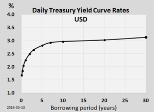
Image from Wikipedia
When applied to the world of mobile marketing, yield curves become an investigation of the yield (according to your KPI of choice, such as ROAS, LTV, or customer acquisition cost), based on different dimensions of investment. While this is most easily applied to studying yield by different levels of spend or bids, I use the term “dimensions,” in order to allow the incorporation of more innovative methods of leveraging yield curves, such as those listed in the final section.
So what is a yield curve and how do you use one in the context of mobile marketing analytics?
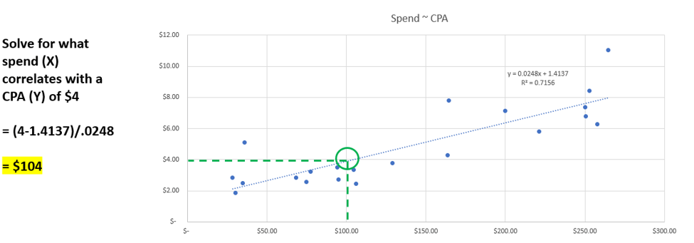
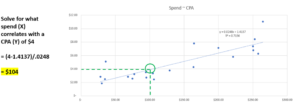
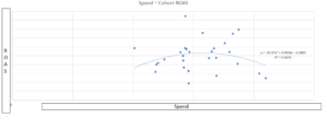
Surprisingly, creating a yield curve is very easy to do – simply plug in your investment dimension into the x axis, your yield into the y axis, and create a scatter plot.
While this is interesting in and of itself to behold, the really valuable part of yield curves comes next. Once you’ve plotted your scatter plot, the second step is to add a trend line to the data, in order to transform the data distribution from a blog into an actual calculation that can quantify the yield of the investment based on the correlation patterns expressed in the data. For this step, the trend line which is easiest for beginners is the linear trend line (y = mx + b).
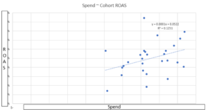
The third step after plotting a trend line through the data and adding the R-squared and equation to the chart is to break out your algebra skills and solve for X. By solving for X, you can determine approximately what quantity of X (i.e. spend) correlates with a given level of Y (i.e. ROAS).
As shown in the above example, yield curves are an easy to use tool that can help guide analyses and decision-making.
Yet as always, new tools will come with a caveat. The Excel linear trend line equations plotted onto the yield curves shown in this article are based on simple mathematics and historic data, and as such should be used as directional insights, rather than being taken as perfect predictors. Using more powerful tools such as R-based multi-variable regressions, time series forecasts, data clustering and machine learning techniques can help to improve the correlation accuracy and prediction strength of yield curve analysis.

There are several shapes of yield curves that you will encounter in your analyses; here are three of the most common.
Diminishing Returns
Diminishing returns is likely the most common shape of yield curve, which indicates that as your investment increases, your yield diminishes. This is the depiction of a natural phenomenon in advertising, wherein the larger an advertising campaign’s scope grows, the more waste is produced through means of reaching people who are less and less likely to be a product’s core target market, cannibalization between marketing efforts for credit of user acquisition, the rising costs to reach users due to waning user engagement with your ads, and many other factors.
When your yield curve takes this shape, there are two important actions to take:
First – solve for the optimal yield based on your target yield. This involves solving for X using the trend line equation in order to remain efficient within the bounds of your campaign's performance trends, such as the amount of spend or the bid level that correlates with your target D7 ROAS of 25%.
Second – investigate the factors that are causing your yield to diminish as your investment increases. This could be due to reasons such as underperforming audience targets, poor creative, an insufficient volume of events for algorithm targeting, or increased auction competition.
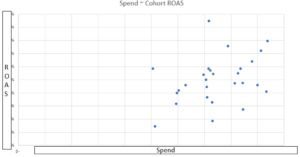
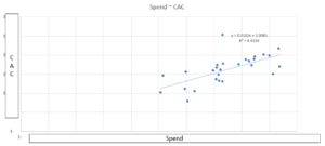
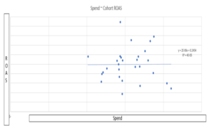
Stable Returns
A more optimistic yield curve shape is one of stable returns. This is the depiction of a mobile advertising campaign which is effective at turning dollars into growth. The word effective refers to the ability of every additional dollar to not diminish in its outcome of driving ROAS or newly acquired customers. With proper targeting, creative, and allocation of budget between channels, a yield curve showing stable returns can be maintained for some time before threatening to become diminishing returns.
So long as your data exhibit this shape of yield curve, you may continue to invest with confidence, while monitoring for changes in yield.
Improving Returns
Lastly, the best yield curve shape to perceive is one of improving returns. This is the depiction of a mobile advertising campaign which is not only effective, but efficient at turning dollars into growth. The word efficient refers to the ability for every additional dollar to actually generate incrementally better outcomes in ROAS or newly acquired customers. In the age of algorithms, machine learning and viral loops, which are powered by large quantities of data, the shapes of improving returns can be attained from powerful campaigns such as Facebook’s Value Optimized (VO) bidding setting. The “honeymoon” phenomenon observed in newly launched social advertising campaigns per country is also an example of an improving returns yield curve.
If your data exhibits this shape, you should press your advantage and raise investment to maximize your returns from this period of hyper-efficiency; however, it is important to also realize that improving returns are only temporary in nature, and sooner or later will devolve into stable, or eventually diminishing returns. Thus, proper organizational management of this type of yield curve requires two additional steps.
First, the marketing leadership in charge should follow the 80/20 rule, investing most of their time leaning into extending this period for as long as possible through tactics such as raising budgets and eventually bids, expanding audiences, and churning out iterations on any high-performing creatives.
Second, with the other 20% the marketing leadership should be careful to build a plan of what to do once the yield curve changes shape, including next steps across strategy/data/creative/targeting that aim to support stable returns, or at least aim to stave off a full decline into diminishing returns. This plan should also include a retrospective of the factors that may have produce the improving returns yield curve and a hypothesis of how to find the next big win that unlocks another improving returns yield curve.
As part of this 20% time, the marketing leadership should also take the time to effectively communicate with stakeholders that this type of growth is ephemeral in nature, in order to avoid confusion about where the incredible returns have disappeared to and how to immediately turn them back on, or blame over the waning of a phenomenon that is in virtually all cases inherently not a sustainable state. If stakeholders are not primed with this narrative, it could ensnare marketing leadership in a whirlpool of defensive maneuvering and send them on a wild goose chase, rather than working productively on executing against the plan for next steps.
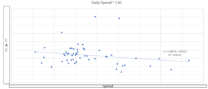
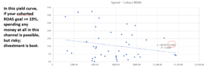
To illustrate the sugar rush outcome of an overheated improving returns yield curve, consider the below image.
In this yield curve, the hyper-efficiency of rising ROAS with rising spend deteriorates after the budget surpasses ~$1,600 in daily spend. From this point the returns begin to diminish, leaving the overall shape of this yield curve stable, as shown below.
Some useful other applications of yield curves include:
- Leveraging upstream leading indicators to predict downstream performance, such identifying the maximum cost per install or signup that yields a targeted cost per paying user.
- Analyzing a 4-week test of a new ad channel’s performance to determine whether it’s feasible to continue running on that channel based on a particular ROAS target.
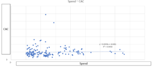
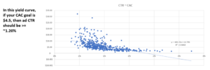
- Determining whether there is a correlation between variables of interest, such as CTR and CAC.
That’s all for today! Thanks for reading and stay tuned for more posts breaking down mobile marketing concepts.
Be sure to bookmark our blog, sign up to our email newsletter for new post updates and reach out if you're interested in working with us to optimize your app's mobile advertising or ASO strategy.
Incipia is a mobile marketing consultancy that markets apps for companies, with a specialty in mobile growth marketing, analytics & business intelligence, and creative production. For post topics, feedback or business inquiries please contact us, or send an inquiry to projects@incipia.co
Categories
Tags:
- A/B testing
- adjust
- advertising
- adwords
- agile
- analytics
- android development
- app analytics
- app annie
- app development
- app marketing
- app promotion
- app review
- app store
- app store algorithm update
- app store optimization
- app store search ads
- appboy
- apple
- apple search ads
- appsee
- appsflyer
- apptamin
- apptweak
- aso
- aso tools
- attribution
- client management
- coming soon
- design
- development
- facebook ads
- firebase
- google play
- google play algorithm update
- google play aso
- google play console
- google play optimization
- google play store
- google play store aso
- google play store optimization
- google uac
- google universal campaigns
- idfa
- ios
- ios 11
- ios 11 aso
- ios 14
- ios development
- iot
- itunes connect
- limit ad tracking
- ltv
- mobiel marketing
- mobile action
- mobile analytics
- mobile marketing
- monetization
- mvp
- play store
- promoted iap
- promoted in app purchases
- push notifications
- SDKs
- search ads
- SEO
- skadnetwork
- splitmetrics
- startups
- swift
- tiktok
- uac
- universal app campaigns
- universal campaigns
- user retention
- ux
- ux design