Incipia blog
10 Promoted In-App Purchase Icon Examples
Fact: Apple's new promoted In-App Purchases do not have their own videos or screenshots and have descriptions limited to 45 characters. This means that the promoted IAP icon must play a big role in conveying meaning about what users can get from your IAP. This is made even more important by the ostensibly lower conversion rate of promoted In-App Purchases; ounce-by-ounce, any improvement in conversion rate for promoted In-App Purchases will yield more value than an app download.
To help you on your way in designing promoted IAP icons that convert, here are 10 examples of IAP icons, plus brief commentary on their design.
Not sure where to go next with promoted IAP? Check out our post on How to Optimize Promoted IAPs for more ideas on how to make your Promoted IAP stand out and convert more users into purchasers.
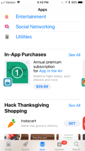
Promoted IAP Icon #1: App in the Air
App in the Air's promoted IAP icon offers a bit of visual-intent recognition vis-a-vis the globe image in the background. It also uses a circular or cyclical visual representative, depicting the idea of a subscription, which is a nice, subtle touch. Using a number may appeal to users (anecdotally, we have seen numbers help improve conversion rate; numbers can also convey more information), but the number one could be confused for a onetime purchase, a one month's subscription or something else. The icon also doesn't relate to the description of the IAP, either.
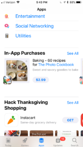
Promoted IAP Icon #2: The Photo Cookbook
This icon depicts a set of several different visuals, which represents the idea well that users receive multiple benefits from purchasing the promoted IAP. The icon also relates to the description and name, which refers to baked goods (though it's hard to distinguish whether the items are sweet or savory). The icons share a similar background, which is nice for consistency and reducing noise, but also plays down variety.
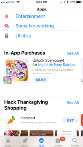
Promoted IAP Icon #3: My Little Pony
My Little Pony's icon combines the strength of character recognition with multiple benefits to explain to users they they get all the characters with this pack. Sparkles and other design tricks (two characters have different expressions) make this icon fun and engaging too, and the icon maintains the brand by placing the brand logo into the bottom-right, given that the logo is too small to notice in the regular app icon. What's happening in the bottom-right of the IAP icon is unintelligible at this size with the logo atop it, though, and adds unnecessary noise to the icon.
For games especially, icons (app icons or IAP icons) should be fun and grab attention just like a toy in the store aisle (and make you look/read more), and this one does well.
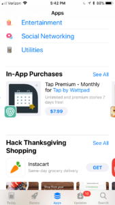
Promoted IAP Icon #4: Wattpad
Like App in the Air's icon, Wattpad's IAP chooses to associate with the time of the IAP (one month), rather than the content of the IAP. The repetition of this design pattern helps to illuminate that there are emerging two main approaches of IAPs icon design (basic time period-based vs complex use case-based), which is similar to the basic branded logo/tagline + gradient background vs complex use case design patterns of Android feature graphic design.
Wattpad's IAP also potentially produces confusion by mentioning one month in its name but using the description to mention 7 days free, which could confuse some users as to whether the IAP is actually for one week or one month. The description could be more clear by instead saying something along the lines of "Get an extra 7 days of stories free."
The star is used as an extra bit of flair to liven up the icon, or perhaps relate to the free extra 7 days.
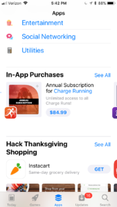
Promoted IAP Icon #5: Charge Running
Charge Running's IAP icon uses the same branded coloring as its icon for cohesiveness, but explores a more meaningful/inspirational visual by opting for a real person image, vs an outline of a person. Actually repeating the purchase type and duration (i.e. annual subscription) helps increase user certainty of what is being bought (which can be useful if the name focuses more on keywords).
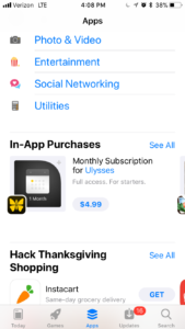
Promoted IAP Icon #6: Ulysses
Like Wattpad, Ulysses exemplifies the basic (and safe) time period-based IAP icon design, and also repeats the time duration in text form like Charge Running, increasing certainty of the purchase.
Note that in both Ulysses' and Wattpads' icons, the first day in the mock calendar is colored differently; a design trick.
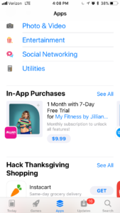
Promoted IAP Icon #7: MyFitness by Jillian M
Combining the inspiration of Charge Running with the depiction of the main character of My Little Pony produces an "ideal state" visual and what is sure to be a high-converting promoted IAP for Jillian Michaels. The icon also does not relate to the time period duration of the IAP, nor the specifics of what is included in the IAP (like Charge Running), which could be too complex to depict in the space of the icon.
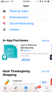
Promoted IAP Icon #8: Journi
Journi's icon opts for the use-case route, attempting to illustrate in visual form each of the purchase goodies. By using a simple gradient background, two colors and concentrating the design in the center of the icon to leave plenty of padding, Journi fends off the complexity danger of this use-case approach.
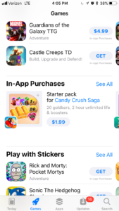
Promoted IAP Icon #9: Candy Crush Saga
Candy Crush's IAP icon is a great example of visually explaining what is contained in a bundled IAP. Promoting an In-App Purchase that bundles multiple benefits into a "premium" or "pack" purchase does not make sense, given that users cannot be expected to know what might sensibly be included in such a purchase, until they can actually use the app. Candy Crush also goes one step further by using numbers to describe the different amounts of the multiple individual benefits included in the IAP - a great touch and one that lines up well with the description!
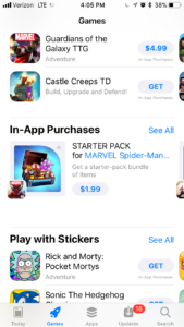
Promoted IAP Icon #10: Marvel Spider Man
Spider Man does one slightly better than Candy Crush by putting the individual goodies into a container, which is comforting to people. When buying real items at the store, do people throw it all in your face and expect you to carry it all? No - they give you a bag or some container. You can play on this latent association in the App Store, too!
That said, Spider Man doesn't explain the quantity of each item.
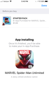
Here we can also see what happens when the user taps the IAP and is taken to the app's product page. At this point if the IAP is tapped again, the App Store begins downloading the app and prompts the user for confirmation. The app has the ability to present the IAP for purchase confirmation once the app is downloaded.
That's all for now, folks! Be sure to bookmark our blog, sign up to our email newsletter for new post updates and reach out if you're interested in working with us to optimize your app's ASO or mobile marketing strategy.
Incipia is a mobile app development and marketing agency that builds and markets apps for companies, with a specialty in high-quality, stable app development and keyword-based marketing strategy, such as App Store Optimization and Apple Search Ads. For post topics, feedback or business inquiries please contact us, or send an inquiry to hello@incipia.co.
Categories
Tags:
- A/B testing
- adjust
- advertising
- adwords
- agile
- analytics
- android development
- app analytics
- app annie
- app development
- app marketing
- app promotion
- app review
- app store
- app store algorithm update
- app store optimization
- app store search ads
- appboy
- apple
- apple search ads
- appsee
- appsflyer
- apptamin
- apptweak
- aso
- aso tools
- attribution
- client management
- coming soon
- design
- development
- facebook ads
- firebase
- google play
- google play algorithm update
- google play aso
- google play console
- google play optimization
- google play store
- google play store aso
- google play store optimization
- google uac
- google universal campaigns
- idfa
- ios
- ios 11
- ios 11 aso
- ios 14
- ios development
- iot
- itunes connect
- limit ad tracking
- ltv
- mobiel marketing
- mobile action
- mobile analytics
- mobile marketing
- monetization
- mvp
- play store
- promoted iap
- promoted in app purchases
- push notifications
- SDKs
- search ads
- SEO
- skadnetwork
- splitmetrics
- startups
- swift
- tiktok
- uac
- universal app campaigns
- universal campaigns
- user retention
- ux
- ux design