Incipia blog
Apple Search Ads Creative Set Testing for ASO in the Wild
One of the best new methods for alternative A/B testing in ASO is to leverage your Apple Search Ads campaigns for testing new screenshots and videos. Creative sets are naturally also an excellent way to not only reduce your CPA, but win more auctions and grow scale (after all, TTR is a major factor in determining whether you will win an ad impression or not).
If you're not doing creative set testing - it's time to get on board. Bookmark this article to read later or pass it along to your creative team to provide a source of inspiration when briefing new screenshots.
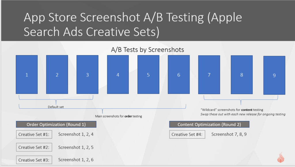
When setting up your creative sets, be sure to order the screenshots in the proper left-to-right order that you want them to appear live. Apple does not allow for screenshots to be re-ordered from right to left, so you cannot re-arrange the order of screenshots in your creative sets.
Our recommendation for testing portrait creative sets is to first tackle the low-hanging fruit by re-ordering the first 3 screenshots (if you do not have a video) so that the third screenshot is replaced with the fourth and each additional screenshot, one at a time. This allows you to see the performance of each screenshot that is below the fold (i.e. only visible from the product page).
If you do have a preview video, then test a creative set with and without the video with each combination of first 3 screenshots to see which three have the best performance.
Next, move on to testing wildcards, or screenshots with significantly different visual layouts. The following examples of creative sets in the wild mostly focus on wildcard tests.
Use Phiture's handy creative set statistical significance tool to determine when you have had enough data to call a winner. If you do find a winner, you can try moving those screenshots to the first three in the store and measuring whether your conversion rate all-up improves.
Here are 15 examples of creative set testing found in the wild, with commentary on the techniques used by each.
Amazon
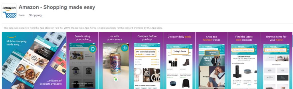
Amazon's example appears to be one of the more rare uses of creative sets. While most apps use creative sets to test different visual layouts, Amazon's example is that of optimizing the in-phone content and captions to keyword intent. As you can see, Amazon is likely using single keyword ad groups (SKAGs) and aligning the following screenshots to these particular keywords:
- Screenshot 1, 2, and 6
- Caption: Discover daily deals
- Targeted keywords: deals, coupons, discounts, etc.
- Screenshot 1, 2, and 7
- Caption: Shop top fashion trends
- Targeted keywords: shopping, clothing, etc.
- Screenshot 1, 2, and 8
- Caption: Find the latest tech trends
- Targeted keywords: electronics, etc.
- Screenshot 1, 2, and 9
- Caption: Browse items for your home
- Targeted keywords: home decor, etc.
While this creative set testing is likely too specific to each keyword to apply the best variant as the first three screenshots, this practice can help Amazon improve the messaging and relevance of the screenshots shown to a searcher's query, improving the app-intent fit and likely raising TTR and CVR.
Twine
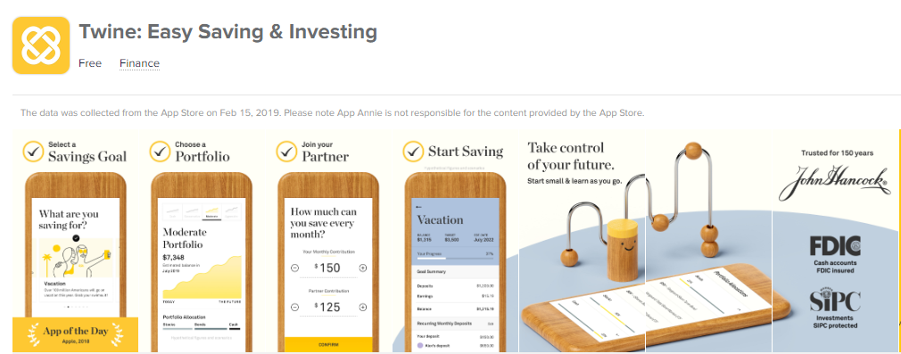
Twine's screenshots exude a heavy investment into branding (e.g. wooden phone, color cohesion, font/iconography), and the creative set test here appears at a high level to be a test of the following characteristics of design in the first 3 screenshots:
- Heavier vs lighter design meddling (real-world scene vs traditional vertical phones)
- Use of credibility (FDIC, SIPC, 150 years of parent company John Hancock vs app of the day)
- Step-by-step process vs 3-line caption and text call-outs
Transit
![]()
Transit is creative set testing a couple different main changes, including:
- Combined first 2 screenshots with a well-arranged set of call-outs vs traditional single screenshot style
- Captions on top vs bottom
Transit could also test the first two screenshots and each of the others, to see which screenshot belongs third.
Expedia
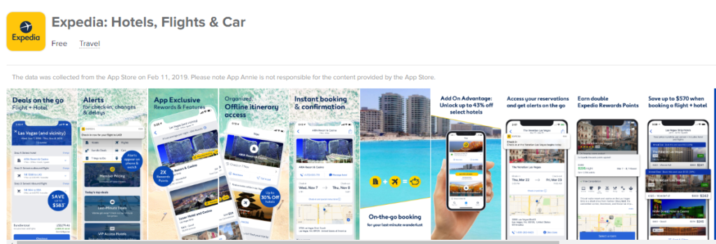
Expedia appears to be setting themselves up to do several creative set tests for the first two screenshots, including:
- The traditional single screenshot style vs using a connected background first 2 screenshots vs
- Using a beach waves background vs plain white background
- In the same beach wave format, testing tilting the phone vs the traditional straight vertical orientation
- Layering on circular call-outs vs screen UI pop-offs (the back of the pack)
It's important to note that only 3 creative sets can show on-screen at once, so designing across more than 3 screenshots is not advisable.
Relax Melodies
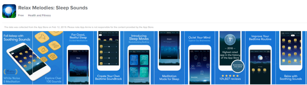
While Relax Melodies could simply be listing many screenshots for users to browse through, they could easily test each of the screenshots from 3-10 as screenshot #3 vs the combined first 2 screenshots (or other combinations).
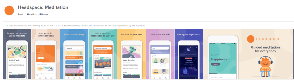
Headspace
Headspace could also simply be listing many screenshots for users to browse through as does Relax Melodies, which sets them up nicely to test different ordered combinations.
But Headspace uses a lesser-known trick of using different orientation screenshots, in order to test how a landscape style screenshot may perform as screenshot #1 in the search results page (replacing the 3 individual screenshot tiles of portrait orientation). App Annie shows the orientation of the landscape screenshot in the first list, while a real screenshot in the product page shows the awkward view when this screenshot is not located first. It's a good thing this landscape screenshot is located last!
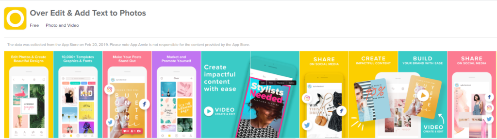
Over
Like Expedia, Over appears to be setting themselves up to do several creative set tests for the first two-to-three screenshots, including:
- Traditional single screenshot style vs combined first 2 screenshots with:
- Tilted screenshot style vs traditional straight vertical orientation
- Left-side content vs centered combined 2 screenshots with multiple captions located in corners
- Smaller captions vs larger captions
Over also mixes in second type of test that uses a similar base design layout with several sub-tests in the SHARE screenshots:
- Yellow share background vs salmon color background
- A scattered social icon overlay vs an ordered, stoplight-style social icon overlay
- Two different in-phone screenshots
- A colored yellow phone profile vs a white phone profile
While it would be best to test each of these above elements individually, creative sets make it difficult to isolate and test such small variations, which leads to the focus of testing lots of big changes, hoping for a winner.
The challenges in running a true A/B test through creative sets include:
- No true randomized or split feature (i.e. you can't force the same number of randomized impressions to go to each variant)
- No guarantee that creative sets will serve at the same volume
- A limit of 10 screenshots at once, requiring testing to be done in wave with new version releases
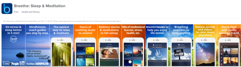
Breethe
Breethe appears to use creative set testing in to explore the following main variations:
- Color of background (orange vs blue vs yellow)
- Within each is a a variation of the background visual (what is perhaps sunset vs clouds and trees)
- In-phone content
- Captions
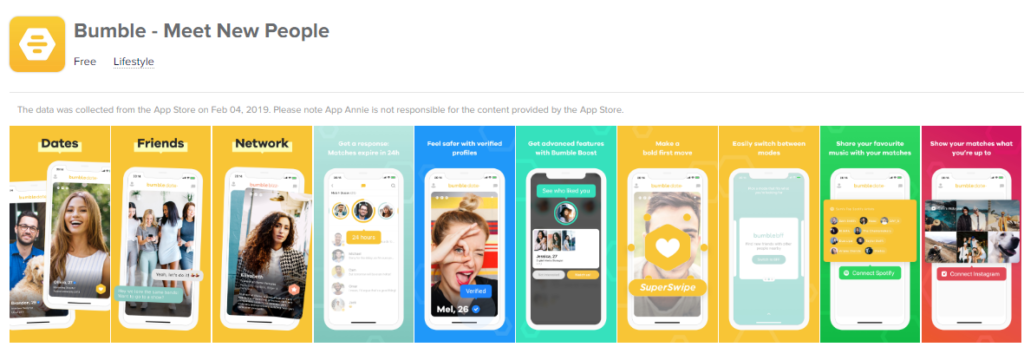
Bumble
Bumble's creative set testing can be observed after the first three screenshots, and is likely focused on ordering of screenshots (captions, in-phone screenshot); but Bumble may also be testing the difference between background (darker vs branded yellow vs higher contrast).
In Bumble's live product page you can also see that the first two tiles are preview videos, meaning that Bumble can also test one vs another preview video, and can test 2 screenshots along with a preview video.
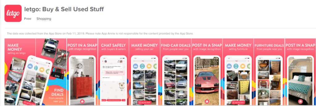
Letgo
Legto's creative set testing at first glance appears similar to a simple re-ordering; but if you look closely you can see that in a few of the screenshots the captions are the same in several screenshots, with only the in-phone content differing; this allows Letgo to test for the best content to place in-phone as screenshot #3 (and can also improve relevance with SKAGs).
Specifically, Letgo is testing different in-phone content for the following captions:
- Post in a Snap
- A dresser vs a car vs a bed
- Make Money
- A list of cars vs a list of home furnishings
Letgo is also testing specific deal types in Find Car Deals vs Furniture Deals (which again is useful for SKAGs).
Seems that Letgo's target market really cares about cars and home decor, doesn't it?
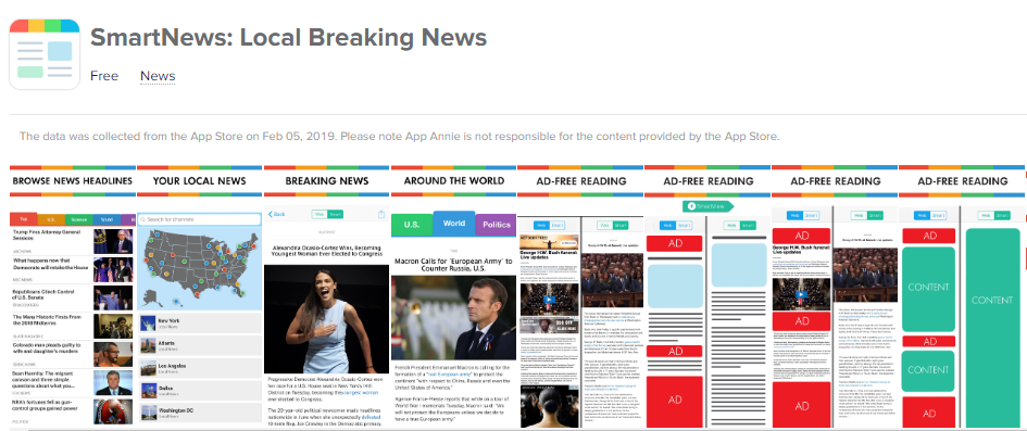
SmartNews
SmartNews appears to be creative set testing a single variation in its creative sets: 3 different layouts of the AD-FREE READING screenshot. If one of these converts better than the other, it will likely be placed as the final screenshot, or leveraged in ongoing creative sets.
This is reminiscent of Letgo's testing strategy and the traditional A/B testing strategy of changing one thing and measuring the results. Given that the ad-free reading is the final screenshot, it's possible that SmartNews may have already used such a strategy to improve efficiency in the conversion potential of screenshots 1, 2, 3, and 4.
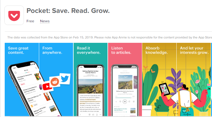
Pocket's creative set testing appears, like those of Twine, to be focused on testing the effects of branding; but in Pocket's case, the default is a lesser branded combined first 2 screenshots, with a brand-illustration focused combined first 2 screenshots being tested.
It's also possible that Pocket is simply telling a story through the screenshots, and not doing any creative set testing :man-shrugging:
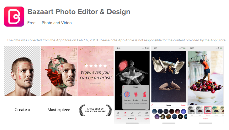
Bazaart
Bazaart is testing two different styles of creative sets, mainly focusing on captioned screenshots vs pure screenshots (no captions).
It's easy to scoff at the basic, un-decorate screenshot, but in practice you'd be surprised at how often pure screenshots out-converts spruced up screenshots. That said, we have typically we have seen this occur more often on Android than iOS.
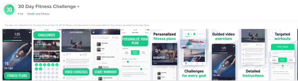
30 Day Fitness Challenge
30 Day Fitness Challenge seems to be testing two different caption styles (both branded, with one using medium contrast captions against a solid fill shape and the other using two-color captions), as well as different in-phone content.
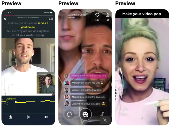
Smule
Last but not least, Smule's sing app takes the rare step to use all 3 preview videos, allowing them to test each video and pick the best converting one to locate first.
That’s all for today! Thanks for reading and stay tuned for more posts breaking down mobile marketing concepts.
Be sure to bookmark our blog, sign up to our email newsletter for new post updates and reach out if you're interested in working with us to optimize your app's ASO or mobile marketing strategy.
Incipia is a mobile marketing consultancy that markets apps for companies, with a specialty in mobile advertising, business intelligence, and ASO. For post topics, feedback or business inquiries please contact us, or send an inquiry to projects@incipia.co
Categories
Tags:
- A/B testing
- adjust
- advertising
- adwords
- agile
- analytics
- android development
- app analytics
- app annie
- app development
- app marketing
- app promotion
- app review
- app store
- app store algorithm update
- app store optimization
- app store search ads
- appboy
- apple
- apple search ads
- appsee
- appsflyer
- apptamin
- apptweak
- aso
- aso tools
- attribution
- client management
- coming soon
- design
- development
- facebook ads
- firebase
- google play
- google play algorithm update
- google play aso
- google play console
- google play optimization
- google play store
- google play store aso
- google play store optimization
- google uac
- google universal campaigns
- idfa
- ios
- ios 11
- ios 11 aso
- ios 14
- ios development
- iot
- itunes connect
- limit ad tracking
- ltv
- mobiel marketing
- mobile action
- mobile analytics
- mobile marketing
- monetization
- mvp
- play store
- promoted iap
- promoted in app purchases
- push notifications
- SDKs
- search ads
- SEO
- skadnetwork
- splitmetrics
- startups
- swift
- tiktok
- uac
- universal app campaigns
- universal campaigns
- user retention
- ux
- ux design