Incipia blog
Google Play Feature Graphic Examples
If you've been looking for more inspiration since our last post on 7 Feature Graphic examples some time ago, then you're in luck! Check out this spread of feature graphics with observations and suggestions on A/B tests that these apps could run.
As a brief recap, the feature graphic is a 1024x500 banner that Android apps can show in the Google Play store. The feature graphic can be designed any way you like. Apps which use a video will have their video appear as the feature graphic.
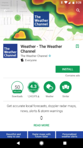
Feature Graphic #1: The Weather Channel
The Weather Channel's feature graphic offers a visual that is immediately recognizable by users familiar with weather apps, which is the weather radar map. Not only is this a recognizable allude to an important feature of a weather category app, but it is also vivid and attracts the user's attention (though at this stage, the eye-catching appeal is less important given the user has already chosen to learn more about TWC's app after clicking in from an earlier impression). Including the icon in the middle of the feature graphic is, in our opinion, a wasted opportunity to either keep the design clean by using the radar map alone, or offer something new to the user (given the same icon is located just below the feature graphic).
Three suggestions on A/B testing this feature graphic image include:
- Add an overlaid 1-3 word caption (key to this would be ensuring it was fully legible on the variable background) – determine whether adding messaging is useful in converting users
- Test different weather features (e.g. forecast, applicable custom content, etc.) – determine which feature best converts users
- Add social proof – reinforce how many downloads TWC has earned, or other accolades – make the app seem appealing enough to download
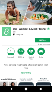
Feature Graphic #2: 8Fit
8fit's feature graphic choice is an excellent one for an app that ties heavily into a lifestyle use case, which is the split/screen shot. Here 8fit hammers home two association in the visitor's mind of 8fit's main purpose: helping people plan meals and workouts. 8fit's screenshots also follow the split/screen design, showing the ever-popular in the fitness world, before and after shot. 8fit also includes subtle branding by watermarking their logo into the top-left corner of the graphic, which is a nice touch.
Three suggestions on A/B testing this feature graphic image include:
- Try a split/screen of a before and after transformation, just in case users don't scroll to the screenshot – determine whether the before/after transformation association is key for converting users
- Use different models for the left, workout-side and the right, meal-side – figure out which model best converts users
- Overlay messaging onto the top of the graphic, such as "lose weight the healthy way," "plans tailored to you," or "workout & meal coaching"– make the app seem appealing enough to download
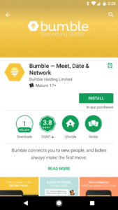
Feature Graphic #3: Bumble
As many brands are wont to, Bumble opts for a plain and clean feature graphic banner with their brand logo, plus their word-based brand name. This jives with Bumble's branding scheme also embodied in the screenshots, which is a classy touch. Yet, the honeycomb sizes in the feature graphic are of a different size than those in the screenshots, which seems strange. This type of feature graphic is the easiest to implement, and most often does pretty well for brands, yet misses the opportunity to take a swing at being innovative.
Three suggestions on A/B testing this feature graphic image include:
- Litter a few match cards into the background – potentially increases the appeal of the design, by making it more engaging as well as connecting with the match-to-meet association
- Add a girl's photo picture with the text "ladies first," similar to the first page in their PR kit – plays up Bumble's differentiator vs all the other meet-to-match apps
- Overlay a caption such as "get connected now" or something intriguing like "who will you meet?"– make the app seem appealing enough to download
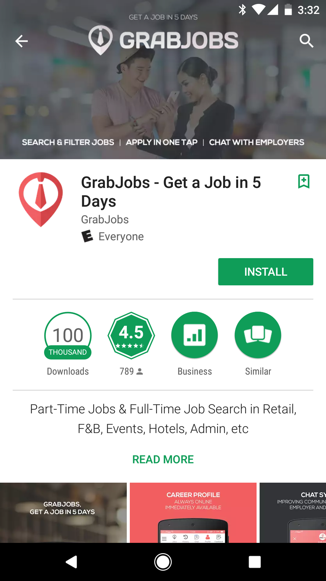
Feature Graphic #4: GrabJobs
GrabJobs uses a slightly translucent stock image of a couple people in what looks like a relevant pose/situation as the main aspect, a few call-outs at the bottom and a brand logo and word-based name at the top (plus a subtle message repeated from the title and first screenshot, "get a job in 5 days."). A solid design that is nice to look at and informative via the call-outs and the slogan. This feature graphic is good and may perform better than a Bumble-style brand banner for a lesser-known brand like GrabJobs, though this feature graphic is not great.
Three suggestions on A/B testing this feature graphic image include:
- Test different stock images – figure out which imagery best converts users
- Test different call-out text – determine which call-outs best convert users
- Split the screen into three parts, with one image depicting each step in the call-outs – ensures that people get the messaging, whether or not they read the call-outs
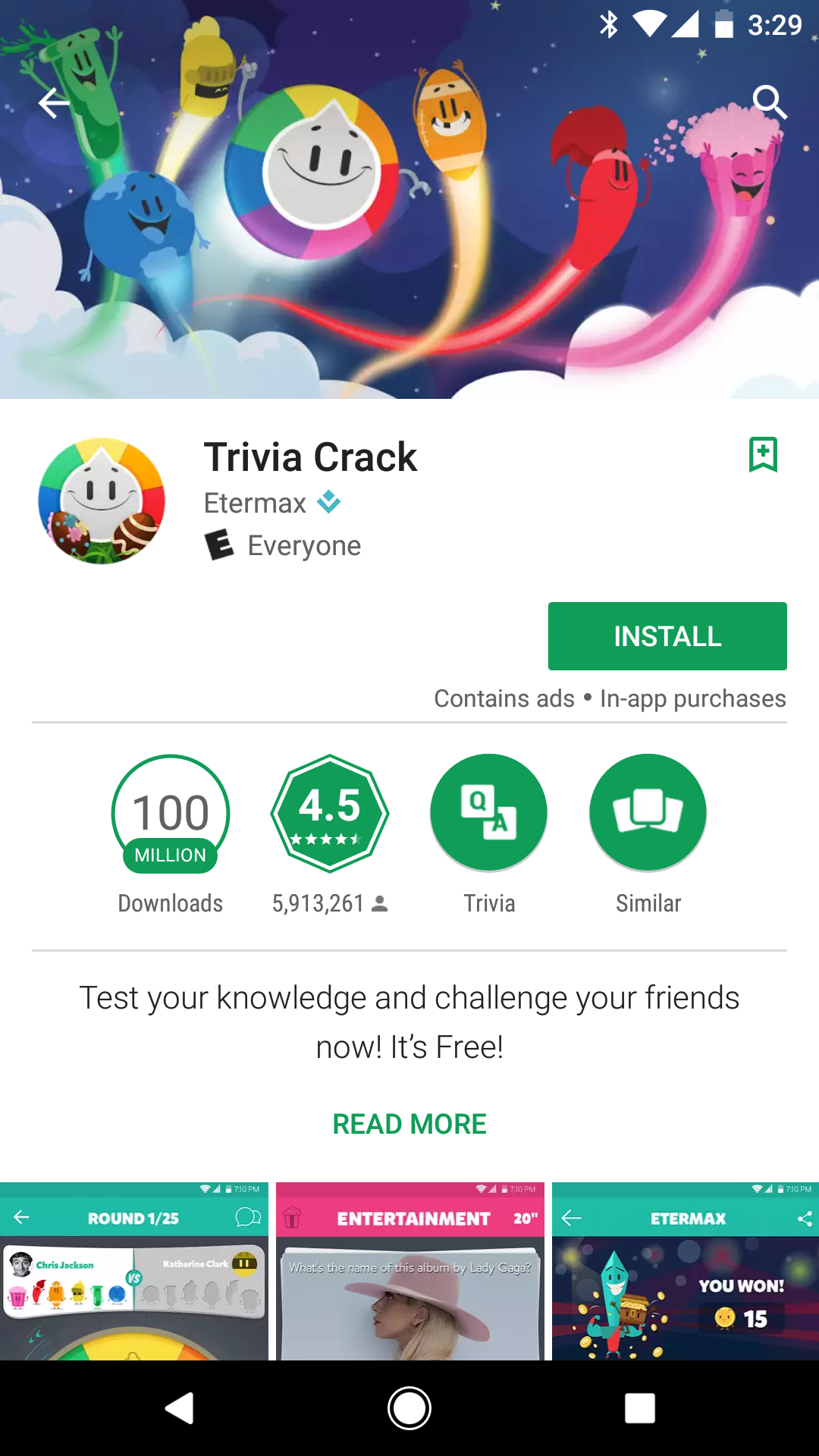
Feature Graphic #5: Trivia Crack
When it comes to feature graphics for games, the sky is really the limit in terms of creativity and what goes into this app banner slot, so critiquing game feature graphics is a difficult task. Trivia Crack here chose a fun and playful, branded approach, which may be the Bumble brand banner equivalent of the gaming world.
Three suggestions on A/B testing this feature graphic image include:
- Test holiday-theming in the graphic, like the icon– indicates to users that the app is updated/maintained enough for the developer to consider the current seasonality, thus indicating the app is maintained and not left to grow outdated
- Add a level or stopwatch time number above each character's head, (functionality pertaining to the game) – determine whether the challenging aspect of the game helps convert users better
- Test adding more characters such as the popcorn box and knight characters, or including fewer characters – potentially increases the appeal of the design, by making it more engaging, or less busy respectively
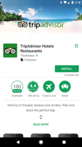
Feature Graphic #6: TripAdvisor
TripAdvisor's approach is a mix between The Weather Channel's and 8fit's, by combining the central logo theme with lifestyle imagery that relates to TripAdvisor's main use case. It is appealing, simple and encourages you to stick around on the page to look a little longer, thus making you more likely to read on and download (and this on-page staying power is the benefit of using real photos).
Three suggestions on A/B testing this feature graphic image include:
- Test seasonal photo iterations (on or off-season vacations, such as summer in winter or fall in summer) – indicates to users that the app is updated/maintained enough for the developer to consider the current seasonality, thus indicating the app is maintained and not left to grow outdated
- Test different vacation backdrops (e.g. metropolis, jungle, countryside, etc.) – figure out which location works best for converting visitors
- Test photos that include people in focus – figure out whether people or the location most impacts conversion rate
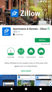
Feature Graphic #7: Zillow
Zillow digs into the same vein as TripAdvisor and the prior mentioned apps with a real-world photo, overlaid with the brand icon and word-style logo.
Three suggestions on A/B testing this feature graphic image include:
- Again, test people in the photo – figure out whether people or the location most impacts conversion rate
- Test different locations for the background – figure out which location works best for converting visitors
- Try call-outs to the bottom or top briefly explaining the benefits of Zillow, similar to GrabJobs – confirm that the app's use cases match the user's intent
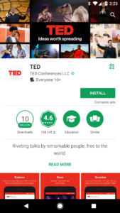
Feature Graphic #8: TED
TED applies a variation on the real-world photo feature graphic by making a mosaic of photos surrounding the TED logo and slogan (yet it's worth noting that this mosaic style is the branded pre-roll for each TED Talk). This approach is interesting, yet it is also a bit busy for a small screen and thus represents a departure from traditional feature graphic designs and may possibly cause confusion or dissatisfaction in users looking for a simple, straightforward understanding of an app.
Three suggestions on A/B testing this feature graphic image include:
- Use a more cohesive set of photos, which all follow a similar theme (e.g. main colors present in the photo, location of the TED speaker [such as on stage], or only shots of the audience) – increase the polish and professional appeal of the app, indicating that the team that makes the app is capable of making a top-notch product
- Test the white background TED l0go with black slogan text – color changes sometimes have a very dramatic impact on conversion rates, as website form designers know well!
- Add a light bulb icon next to the TED logo – increase the association with user intent (i.e. discovery, education, learning)
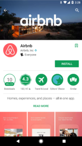
Feature Graphic #9: Airbnb
Somewhat surprisingly, Airbnb does not opt for the Bumble clean/simple branded feature graphic (though Airbnb's screenshots take this approach); instead, Airbnb follows the trend of overlaid branding on real photos (yet Airbnb does not repeat the brand icon, which is a nice touch of polish that the other apps miss). From our perspective, this style (offering a visual that builds an association with the app's use case) is the more effective approach to utilizing a Google Play feature graphic, vs using a simple branding banner.
Three suggestions on A/B testing this feature graphic image include:
- Once again, test different locations as the background – figure out which location works best for converting visitors
- Add one summary data point as an accolade to the top of the feature graphic (e.g. the total number of daily reservations made) – make the app seem appealing enough to download
- Add a slogan to the top of the feature graphic (e.g. "belong anywhere") or some other alluring travel-like messaging, such as "travel the world." – make the app seem appealing enough to download
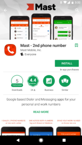
Feature Graphic #10: Mast
Mast here uses the rarely seen these days (yet entirely sensible and useful) approach of increasing the number of screenshots in the Play Store listing, by adding a few into the feature graphic. This allows users to see more of the app without having to watch a video, and is great for apps with a significant breadth of in-app functionality to show off (though three screenshots is a bit much and crowds the feature graphic, and the screenshots are cut off). Using the screenshots without the phone profile is an easy way to increase the size of the screenshots. In addition to the screenshots, the word-style logo and a different visual icon grace the top, as well as a poly-type background design, which is an intriguing touch. One issue that it appears that Mast has encountered (as well as Zillow) is that the background of a custom feature graphic like this or a photo can clash with the icon, the general Play Store UI and the screenshots, which isn't positive for cohesive branding.
Three suggestions on A/B testing this feature graphic image include:
- Naturally, test different in-app screenshots – figure out which shot best converts users
- Reduce the number of screenshots displayed in the feature graphic – focuses user attention on the most important features
- Re-arrange the presentation of the screenshots (e.g. stacking screenshots diagonally) – if done well, this could make the app seem more professional and mainstream, like a product you could pick up at the store.
That's all for now, folks! Be sure to bookmark our blog, sign up to our email newsletter for new post updates and reach out if you're interested in working with us.
Incipia is a mobile app development and marketing agency that builds and markets apps for companies, with a specialty in high-quality, stable app development and keyword-based marketing strategy, such as App Store Optimization and Apple Search Ads. For post topics, feedback or business inquiries please contact us, or send an inquiry to hello@incipia.co.
Categories
Tags:
- A/B testing
- adjust
- advertising
- adwords
- agile
- analytics
- android development
- app analytics
- app annie
- app development
- app marketing
- app promotion
- app review
- app store
- app store algorithm update
- app store optimization
- app store search ads
- appboy
- apple
- apple search ads
- appsee
- appsflyer
- apptamin
- apptweak
- aso
- aso tools
- attribution
- client management
- coming soon
- design
- development
- facebook ads
- firebase
- google play
- google play algorithm update
- google play aso
- google play console
- google play optimization
- google play store
- google play store aso
- google play store optimization
- google uac
- google universal campaigns
- idfa
- ios
- ios 11
- ios 11 aso
- ios 14
- ios development
- iot
- itunes connect
- limit ad tracking
- ltv
- mobiel marketing
- mobile action
- mobile analytics
- mobile marketing
- monetization
- mvp
- play store
- promoted iap
- promoted in app purchases
- push notifications
- SDKs
- search ads
- SEO
- skadnetwork
- splitmetrics
- startups
- swift
- tiktok
- uac
- universal app campaigns
- universal campaigns
- user retention
- ux
- ux design