Incipia blog
iOS 11 ASO Screenshot Examples
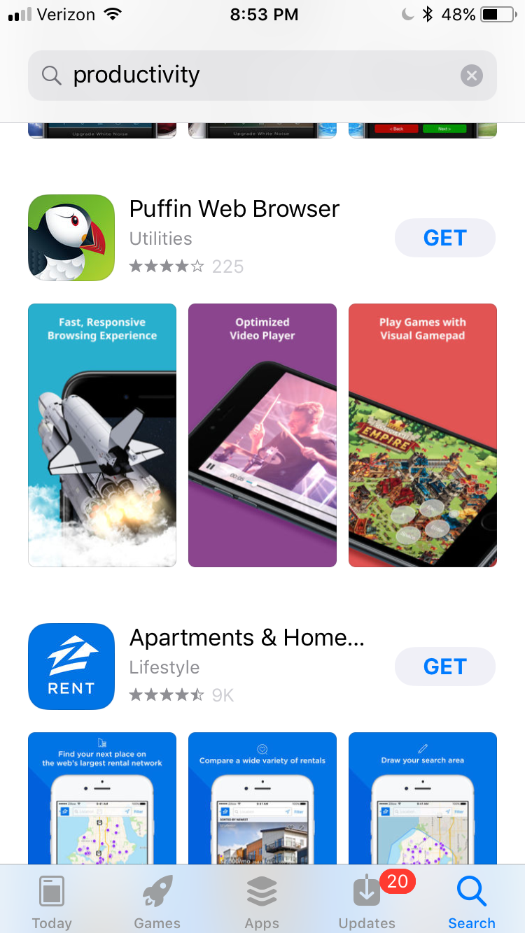
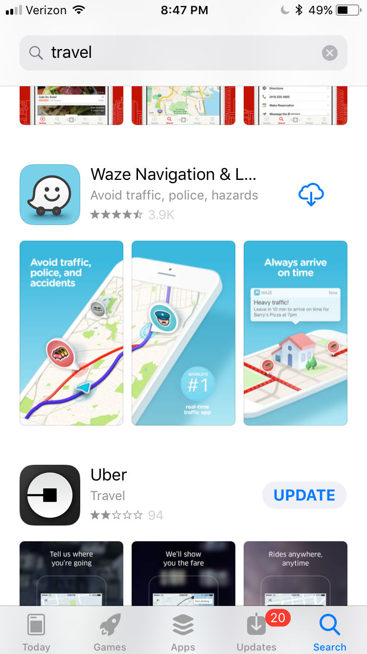
Looking for ideas on how to update your screenshots for iOS 11? Check out this list of screenshots taken from live searches in the App Store with the iOS 11 beta, along with minimal commentary. With the exception of Mint, these examples showcase apps that have only screenshots, and no preview video.
But first, a few predictions on best practices for screenshot in iOS 11 ASO:
- With three screenshots the idea of connecting screenshots together, both visually and via messaging will become more appealing and produce a more cohesive way to sell users on an app's value.
- Tell a cohesive story – use the three screenshots to align with the user's search intent, and present the app as a solution to that intent. While this was possible with iOS 10 and two screenshots, it is more powerful with three.
- With smaller screenshots, captions will need to be more minimal than ever. 1-4 words in large font will become a popular style.
- Not only the caption text, but the actual screenshots themselves will also need to focus on being larger and easier for users to comprehend; in other words, a focus on visuals that do not require users to squint to understand, and are not text-heavy.
- With less legible text, screenshot visuals will also need to take on more of a starring role in the overall screenshot design.
- Lastly – with videos that auto-play on mute, videos will be a must-have in iOS 11 ASO; but this has major implications for screenshots, which will play second fiddle to the preview video in terms of attention, and may not even be looked at until the user taps to the product page. We will publish a post on the interplay between preview videos and screenshots soon after the launch of iOS 11, so stay tuned!
An Example of iOS 11 ASO Best Practices
Deep Relax and Prisma below provide an example of apps that apply 3 of the top best practices for iOS 11 ASO:
- Large, 1-4 word captions – In iOS 11, captions must be very large, as the size of screenshots in iOS 11 is much smaller than in iOS 10, meaning that users will have a much harder time reading normal-sized captions. Prisma hits full marks here, while the captions of Deep Relax could be a bit darker to be more readable against the background.
- Cohesive design – Leveraging 3 screenshots together for a bigger impact (i.e. conversion rate) on the user overall is a big best practice in iOS 11 ASO. Each of these screenshots has a design that connects well altogether and also builds in terms of the messaging the screenshots overall tell when moving from left-to-right. Deep Relax uses a very cohesive visual design, but has an opportunity to improve in messaging cohesiveness.
- Interesting design – especially with Deep Relax, the screenshots are quite interesting to behold, and thus stand out well against other app results, calling to the user's eye as they scroll through results. Good design is extra important in iOS 11 ASO because each app result has a smaller overall percentage of the, so users will never fully focused on only one app when scrolling through search results.
YouTube TV here provides a partial example of a 4th best practice, which is to provide users with a 3-part explanation of the app's solution to the user's intent. The 3-part explanation works like this:
- Screenshot #1 aligns with the user's search intent (in this case, live/streaming TV), focusing on getting the user to stop scrolling by indicating to users that the app is relevant for their need.
- Screenshot #2 explains how the app solves the need, focusing on convincing the user to continue reading or download at that point. In this case, YouTube TV explains a feature, which we can assume is very valued by users with the live TV need.
- Screenshot #3 indicates the end-state or "happy outcome" of the user after using the app. Here, YouTube TV connects to the happy outcome by showing a popular TV show.
Visual Pop-Off App Store Screenshot Example
This visual style (also known as a call-out) had a measure of popularity in iOS 10 ASO, likely due to its custom feel and ability to attract attention (especially important now that competing listings occupy a larger space in the search results than in iOS 10). In iOS 11 ASO, the pop-off style may prove more useful for zooming in to 2x or 3x on parts of an app's UI that may be harder to distinguish at a normal size. Or, the pop-off to draw user attention to parts of the screen that they may otherwise miss; an issue exacerbated by the addition of the third screenshot and smaller overall real estate.
UX Mockup App Store Screenshot Example
This style of screenshot (popular among UX designers showing off app projects on Dribbble.com) can be used similarly to the pop-off style to convey custom design, and better user capture attention. For apps with clean branding and UI, this can be a safe choice beyond the traditional vertical phone style.
The second image of Google apps also features the phone-in-hand screenshot style, displayed on a real background. This style is useful for conveying a sense of realism for lifestyle apps, as opposed to the abstract, floating phone/screenshot style, which is classic, yet lacks the context of the app's use case.
Single-Word Caption App Store Screenshot Example
How do you make the most of a small screen while still conveying your message via text? Use a single word for your captions. Single-word captions are likely to become popular in iOS 11 ASO.
Connected Middle Visual App Store Screenshot Example
Similar to the connected-style, this more rare style allows the app to control more of the messaging, by using more text and visuals, as opposed to having to use an actual screenshot. If the app lacks differentiation and is more functional than experiential, this may be a good choice. With three screenshots, this style may become more popular in iOS 11 ASO, by allowing users to still have two screenshots while also better controlling messaging.
Text-Only Shot Visual Caption App Store Screenshot Example
Mint makes use of its preview video poster frame to offer additional messaging to users, using color to highlight one particular use case. Using the poster frame will be a big optimization opportunity for iOS 11 ASO, as the poster frame will show before the user's video has loaded, which may take several seconds depending on the user's internet connection.
The theme green adds a consistent brand feel, and the visuals are also mostly decipherable at a smaller size, and shots 2-3 are also connected by the grocery use case.
Leverage Real Background App Store Screenshot Example
Google's designers deserve some serious credit in the "taking creative risks" department. Google Translate uses a real-world photo to hammer home the app's use case. With three screenshots and a need for larger text, some clever designers for lifestyle apps such as Google's may be able to use real images as backgrounds that play a part in the messaging. Instamotor offers a second real-world background screenshot style example.
Like many apps, however, the caption length/size will represent a challenge in iOS 11 ASO.
Visually Engaging Captions App Store Screenshot Example
Captions have a higher chance to be lost and go unseen in iOS 11 ASO, as the visuals take center stage. By using font to make captions more noticeable, ASOs can mitigate this risk and also turn captions into an attention-grabber. Google Spotlight stories takes the visually engaging caption a full step further and transforms the traditional caption text into images, which plays very nicely with iOS 11 ASO.
Connected-Style App Store Screenshot Example
Per our best practice prediction, the connected-style screenshot will likely proliferate in iOS 11 ASO with the addition of a third screenshot, which allows for a stronger and broader canvas to convey progression than two screenshots can provide.
Shazam and Postsnap combine the connected screenshot style with more text that tells a bit more of a story than a caption alone can muster. With smaller screens, the connected style can be a way to boost text size and retain the use of text as a major component of the messaging strategy.
Visual Cues App Store Screenshot Example
Like the pop-off stlye, visual cues can help in iOS 11 ASO to direct the user's attention to the right areas and explain where smaller visuals can leave users confused.
That's all for now, folks! Be sure to bookmark our blog, sign up to our email newsletter for new post updates and reach out if you're interested in working with us.
Incipia is a mobile app development and marketing agency that builds and markets apps for companies, with a specialty in high-quality, stable app development and keyword-based marketing strategy, such as App Store Optimization and Apple Search Ads. For post topics, feedback or business inquiries please contact us, or send an inquiry to hello@incipia.co.
Categories
Tags:
- A/B testing
- adjust
- advertising
- adwords
- agile
- analytics
- android development
- app analytics
- app annie
- app development
- app marketing
- app promotion
- app review
- app store
- app store algorithm update
- app store optimization
- app store search ads
- appboy
- apple
- apple search ads
- appsee
- appsflyer
- apptamin
- apptweak
- aso
- aso tools
- attribution
- client management
- coming soon
- design
- development
- facebook ads
- firebase
- google play
- google play algorithm update
- google play aso
- google play console
- google play optimization
- google play store
- google play store aso
- google play store optimization
- google uac
- google universal campaigns
- idfa
- ios
- ios 11
- ios 11 aso
- ios 14
- ios development
- iot
- itunes connect
- limit ad tracking
- ltv
- mobiel marketing
- mobile action
- mobile analytics
- mobile marketing
- monetization
- mvp
- play store
- promoted iap
- promoted in app purchases
- push notifications
- SDKs
- search ads
- SEO
- skadnetwork
- splitmetrics
- startups
- swift
- tiktok
- uac
- universal app campaigns
- universal campaigns
- user retention
- ux
- ux design