Incipia blog
Best App Description Practices From the Top 100 Apps
Following up on an earlier study of the top 100 app screenshots, today we analyzed the trends in descriptions of the top 100 apps in the Apple App Store. Below are our summarized & detailed findings, along with additional observations and examples of descriptions lastly. If you have any questions, would like to see the raw data or have an idea for a future app store study, please let us know by sending an email to hello@incipia.co.
Summary Findings
- Being more efficient with the description was the big takeaway, as putting less into the description was correlated with a much better rank across multiple data points:
- The longer the app's description, the worse its rank was. It may be that efficiency leads to a better rank, or that the higher ranking apps simply chose to use fewer characters.
- Furthermore, it seemed that apps which listed their features out (which can take up a lot of space) did not do too much better than those that did not bother.
- Apps that used more contiguous lines in their opening before giving users some white space for breathing room also saw lower average ranks.
- Overall, apps that had custom backgrounds did not see a higher rank than those without custom backgrounds.
- Editor's Notes-annotated apps which had custom backgrounds ranked worse than those that didn't, but non-Editor-annotated apps with custom backgrounds saw a slightly better rank.
- There was a high frequency of, and a higher correlation in ranking for Editor-annotated apps.
- Apps that listed quotes from users or PR saw some of the worst ranking differentials.
- Including social media links or support contact information were both negatively correlated with rank.
The Data
![]()
- Count of description characters vs average rank. More apps used fewer characters, and these apps had a better ranking than those that opted for longer descriptions.
![]()
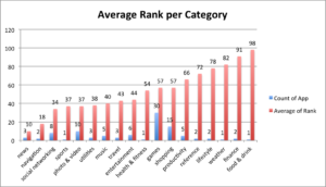
- Count of description characters by category. Music and shopping apps used more than half of their allotted description characters, while shopping apps came close; social, productivity and utilities used less than 1,000 characters on average.
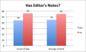 Editor's Notes? A full 44% of apps had Editor's Notes, which could either be a requirement to be highly ranked, or a function of it. 19/44 Editor-annotated apps had custom backgrounds (average rank 48), while 25 did not (average rank 43). 11/56 apps had a custom background, yet did not sport Editor's Notes (these apps ranked better than non-annotated, non-custom background apps: 53 vs 56).

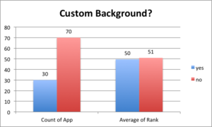 Uses custom background? While 30% of the apps had a custom background, there was no difference in average rank.
-
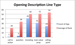
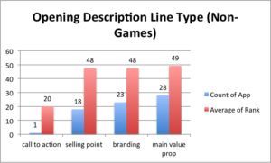
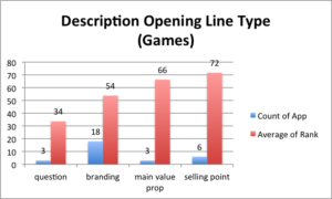
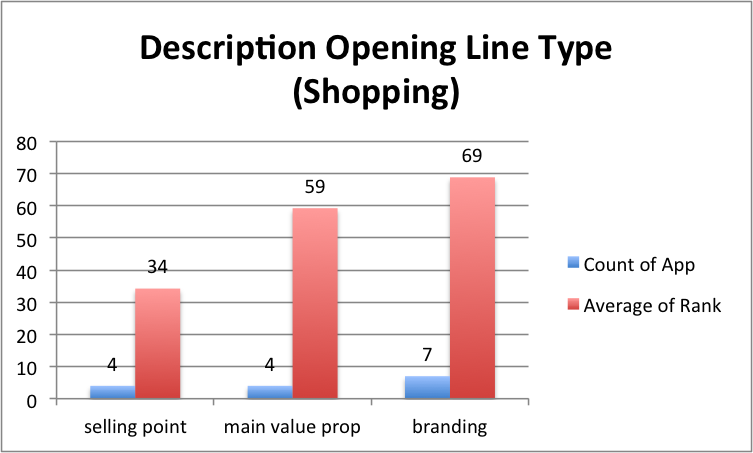
Opening description type. E.g. sales-y vs branding oriented.
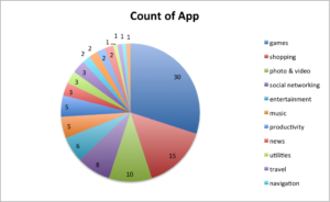
Most non-game apps did not see any correlation between opening types, unless they were shopping apps (selling points did best) or games (questions > branding > main value proposition > selling point).
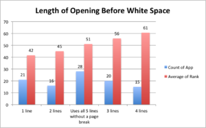 Length of opening before white space. When it came to the first five lines of the description (before the "more" button), there appeared to be value in brevity, up to a point. If apps used three or more lines, they were better off using up all five lines.
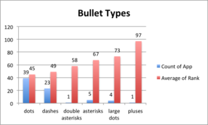 Bullets types. E.g. Using dots vs dashes.
There didn't seem to be a correlation between using bullets or not (50 with bullets vs 51 without); however, there did seem to be some difference between the types of bullets used, with more and higher-ranked apps choosing classic dots or dashes, vs other bullet types.
- Features described? Surprisingly, most apps that detailed their features in a manifest way (e.g. "features list" or listing features of the app without the section header) did not see a better average rank than those that did not (50 with, 51 without). When filtering for non-games, though, feature-descriptive apps saw a small improvement, with an average rank of 47 for describing features vs 50 for not.
- Provides a "how it works" section? 9 apps explained how their app worked, yet in vain (average rank 52 with vs 50 without).
- Use case descriptors? 14 apps used language exploring use cases of their app, with barely any effect (50 with vs 51 without)
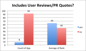 References user reviews or PR quotes. Astonishingly, this was one of the starkest differences in average rank. The 8 apps that tried to leverage their word of mouth were punished, with collective rank averaging 64, vs 49 for apps that kept mum.
- Includes social media links? There wasn't an improvement in rank for the 17 apps that added social (52 with vs 50 without)
- Includes support contact links? Interestingly enough, apps that did not provide a support contact had a better rank than those that did (57 with vs 49 for without).
Other Observations:
- Describing premium features was something that many apps did. Many games explained that the game was free to play, but that some items were available for purchase.
- Some apps, like Cooking Fever and Trivia Crack created a brand persona and used that voice to speak to visitors in terms of "you" and "we" (the brand).
- A good number of apps took the time to inform users of various must-knows, including:
- Advertising/data collection.
- The tendency for using GPS to consumes a lot of data battery life.
- Terms on subscriptions and auto-renewals.
- Which devices the app was optimized for (or not; Minecraft: Story Mode used its first description line to warn iPhone 4 and 4S users to STAY AWAY). Mentioning iMessage/iWatch/iPad/tvOS compatibility was also common.
- Links to privacy policies.
- Curiously, a decent number of apps, like WhatsApp, used CAPITAL LETTERS as their section headers or bullet first words; yet use of symbols to grab attention in the first five lines was limited.
- Related to the correlation between characters used and rank, many apps focused on describing outcomes, rather than going through all the details of features in the app.
- Target Cartwheel (See what your friends are saving on).
- Amazon App (Shop just as you do on the web).
- Twitter (Join in on all the action by sharing what’s happening in your world).
- Some apps took to placing social proof, brand slogans and user reviews/PR either at the bottom of the description or after a 2-3 line short description of the app, rather than immediately in the opening five lines, like Venmo and SoundCloud.
- Some games, such as Clash Royale and Roblox linked to a "parent's guide."
- Several apps also spent a good number of characters name-dropping celebrity, brands and artists, such as Minecraft: Story Mode, iHeartRadio and Hulu.
Description Examples:
- Opening description line:
- Main value prop – Instagram (Instagram is a simple way to capture and share the world’s moments)
- Branding – Snapchat (Life's more fun when you live in the moment :) Happy Snapping!)
- Selling point – Pandora (Powered by the Music Genome Project®, the most comprehensive music analysis ever undertaken, Pandora gives you personalized radio that plays what you love and continually evolves with your tastes.)
- Question – Juju on the Beat (Can you complete the Juju Running Man Challenge?)
- How it Works – Uber:
- Requesting your Uber is easy—here’s how it works:
- - Just open the app and tell us where you’re going.
- - The app uses your location so your driver knows where to pick you up.
- - You’ll see your driver’s picture, vehicle details, and can track their arrival on the map.
- - Payment can be made by credit card, cash in select cities, Apple Pay, Android Pay, PayPal, and more.
- - After the ride, you can rate your driver and provide feedback to help us improve the Uber experience. You’ll also get a receipt by email.
- Requesting your Uber is easy—here’s how it works:
- Use cases – Google Maps
- Discover places and explore like a local
- • Find top-rated restaurants and local businesses, wherever you are
- • Decide on the best places to go with reviews, ratings, and pictures of foods and interiors
- • Plan your visit and see menus, make reservations, and find when places are typically busiest
- • Help others discover the best places by sharing reviews, photos and more
- • Save places you want to or often visit, and quickly find them later from any computer or device
That's all for now, folks! Be sure to bookmark our blog, sign up to our email newsletter for new post updates and reach out if you're interested in working with us.
Incipia is a mobile app development and marketing agency that builds and markets apps for companies, with a specialty in high-quality, stable app development and keyword-based marketing strategy, such as App Store Optimization and Apple Search Ads. For post topics, feedback or business inquiries please contact us, or send an inquiry to hello@incipia.co.
Categories
Tags:
- A/B testing
- adjust
- advertising
- adwords
- agile
- analytics
- android development
- app analytics
- app annie
- app development
- app marketing
- app promotion
- app review
- app store
- app store algorithm update
- app store optimization
- app store search ads
- appboy
- apple
- apple search ads
- appsee
- appsflyer
- apptamin
- apptweak
- aso
- aso tools
- attribution
- client management
- coming soon
- design
- development
- facebook ads
- firebase
- google play
- google play algorithm update
- google play aso
- google play console
- google play optimization
- google play store
- google play store aso
- google play store optimization
- google uac
- google universal campaigns
- idfa
- ios
- ios 11
- ios 11 aso
- ios 14
- ios development
- iot
- itunes connect
- limit ad tracking
- ltv
- mobiel marketing
- mobile action
- mobile analytics
- mobile marketing
- monetization
- mvp
- play store
- promoted iap
- promoted in app purchases
- push notifications
- SDKs
- search ads
- SEO
- skadnetwork
- splitmetrics
- startups
- swift
- tiktok
- uac
- universal app campaigns
- universal campaigns
- user retention
- ux
- ux design