Incipia blog
Why the Art of Form Optimization is Absolutely Worth Your Time
This post was originally featured as a guest article on the Appsee Product Mavens Blog.
While most app teams know that forms are necessary to capture vital user data or actions, many app teams still treat forms as a check the box activity, rather than area for crucial focus. The importance of forms means poor or even average form completion rates can become a bottleneck that can increase your active user acquisition costs. Forms can also be an important part of your top-of-funnel user acquisition strategy if their purpose is to drive reviews or referrals. To illustrate the importance of forms with data: making a 10% improvement in the onboarding flow completion rate for an app receiving 1,500 new installs per day with an ARPU of $2 equates to an extra $109,500 per year in revenues.
Read on to learn several tips and tricks that can be used to optimize two of the most common types of forms, as well as take learnings from examples of other kinds of forms found in three popular apps.
Onboarding Forms
For apps in which users can sign up for a profile, logically information must first be collected in order to initiate the user’s profile. Airbnb is an example of a profile-based app, and one that has a well optimized signup form, despite being longer than the traditional “username + password” signup form.
- Enter first and last name
- Enter email
- Enter Password
- Select birthday
- Enable push notifications
Throughout its onboarding form, Airbnb utilizes a bright and cheery UI design, friendly explainer text at the top of each step and “all-clear” check marks, all of which take the annoyance out of filling out Airbnb’s form, even bordering on actually being slightly enjoyable.
Also, by using a progress bar, Airbnb is able to avoid cramming everything onto one screen (which can overwhelm users) while still allowing users to know about how many more steps to expect. Additionally, Airbnb tells users why they should enable push notifications, and how it will benefit the user. People naturally dislike staring into the unknown, hence we have the professions of science and philosophy!
Lasyly – Airbnb uses a custom-designed push notification permission request screen, which is a best practice as getting permission to send users push notifications can be a challenge, and a little extra effort can go a long ways.
Summarized tips for optimizing onboarding forms:
- Only require users to provide information that is absolutely required at the stage the user is in.
- Offer, but allow users to skip entry of information that isn’t not mission critical but can block key workflows (e.g. integrations); this is a low-risk way to familiarize users with those options. Just make sure to tell users who decide to skip those steps where they can complete them later on.
- Show errors as quickly as possible and prevent progress until critical errors are solved to preclude work that must be re-done. Examples include immediate email validation or checking for usernames that do or do not exist.
- If possible, allow users to pull information from other sources (e.g. current location).
- Allow users to show their passwords to reduce mis-entry.
- Provide default text to help users see an example of what a correct response looks like.
- Figure out how to break down expectations and bake them into the flow of your form, like a progress bar or explaining why you need permission to send a user push notifications.
Review Prompt Forms
Another highly important form that even Apple encourages developers to use is the app store review prompt. The current and most popular review flow form goes something like this:
- Initial prompt: “Are you enjoying our app?”
- User selects yes
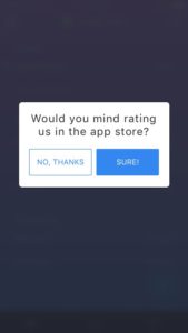
- “Would you mind leaving us a review?”
- Yes
- App sends user to the app store
- Not right now
- Form exits
- Never ask me again
- Form exits and prevent future asks
- Yes
- “Would you mind leaving us a review?”
- User selects no
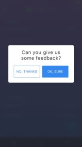
- “Would you mind giving us some feedback?”
- Yes
- App opens email or open support ticket
- No
- Form exits
- Yes
- “Would you mind giving us some feedback?”
- User selects yes
Here is a sample review flow prototype from one of our projects, Gone:
- User receives review form prompt after completing a key action:
- User selects “not really”
- User selects “OK, sure”
 4. User selects “No, thanks” – form exits
5. User taps “definitely” from original prompt
- User is sent to the app store
In general, this kind of review form works well and is widely used by all sorts of apps; below are several ways to take this form to the next level.
Be creative in the form text/images to encourage people to care:
- Text
- Greet your users as “power users,” “MVPs” or some use some other personable greeting relevant to your app’s brand voice.
- Do work for your users and help them figure out what to actually write in their review. Suggest they name their favorite feature or to mention how often they use your app and what for.
- Appreciate your users first. Thank people for using your app before asking them to write you a review.
- Visual
- Use on-brand colors and a different color for the positive-action buttons (like the Gone form above).
- Use custom-designed icons for buttons.
- Design an on-brand background for the form.
- Add an animation to the positive action buttons in the form.
Use data to identify the right times to prompt users, such as:
- Users who performed a key action either once, or multiple times.
- Users who completed a key workflow, or “happy path.”
- Users who have made a purchase.
- People who used your app for x number of minutes OR launched app y number of times (look at your data to see what numbers define your power users).
Other examples of forms
Slack provides users with a top-rate experience when filling out a form for adding a new account to the Slack app. Similar to Airbnb, Slack’s form is bright, colorful and filled with helpful features such as a show password and email validation. Slack also provides a unique option to allow users to choose between typing in their password OR having an email sent in order to add a new Slack account. Because a password reset sends users an email at any rate, Slack allows users to skip the extra step and hassle of having to reset their password by simply confirming their account ownership via email.
- Enter Slack team URL
- Enter email address
- Enter password or request email confirmation

Some forms require lots of tapping in order to select items, such as selecting recipients to send a Snapchat to. While Snapchat does provide groups (e.g. “best friends,” “recently snapped” or “needs love”), there is no ability for users to speed up the process by selecting all or creating a user-defined custom group.
Granted, sometimes there is a reason that forms may not be fully optimized for speed, such as requiring certain vital information or protecting the app from abuse. In Snapchat’s case, although it is frustrating for legitimate users, preventing a method of easily selecting all followers can also reduce the number of spammed snaps that people receive and protect the user experience of all users.
Some form optimizations can be very simple. Take the act of adding a new card to your Venmo account, for example. Here, Venmo uses the number-friendly keyboard vs the traditional keyboard, which enables users to type faster and more accurately.
Now it’s your turn!
Start your form optimization by diagraming out all the forms that exist in your app’s UX and highlight the forms that are located before actions that have the biggest potential value, according to your goals. Then, use a data analytics tool like Appsee to measure data on completion rates of each of those forms and calculate which forms are costing you the most. Appsee even allows you to watch videos of users interacting with your app, which can add a qualitative perspective to your quantitiative analysis. Finally, work with your UX designer and user focus groups to find and implement a winning optimization for each your problematic forms.
Thanks for following along – happy form optimizing!
This post was originally featured as a guest article on the Appsee Product Mavens Blog.
That's all for now, folks! Be sure to bookmark our blog, sign up to our email newsletter for new post updates and reach out if you're interested in working with us.
Incipia is a mobile app development and marketing agency that builds and markets apps for companies, with a specialty in high-quality, stable app development and keyword-based marketing strategy, such as App Store Optimization and Apple Search Ads. For blog/video or speaking requests, business or press inquiries please contact us or send an inquiry to hello@incipia.co.
Categories
Tags:
- A/B testing
- adjust
- advertising
- adwords
- agile
- analytics
- android development
- app analytics
- app annie
- app development
- app marketing
- app promotion
- app review
- app store
- app store algorithm update
- app store optimization
- app store search ads
- appboy
- apple
- apple search ads
- appsee
- appsflyer
- apptamin
- apptweak
- aso
- aso tools
- attribution
- client management
- coming soon
- design
- development
- facebook ads
- firebase
- google play
- google play algorithm update
- google play aso
- google play console
- google play optimization
- google play store
- google play store aso
- google play store optimization
- google uac
- google universal campaigns
- idfa
- ios
- ios 11
- ios 11 aso
- ios 14
- ios development
- iot
- itunes connect
- limit ad tracking
- ltv
- mobiel marketing
- mobile action
- mobile analytics
- mobile marketing
- monetization
- mvp
- play store
- promoted iap
- promoted in app purchases
- push notifications
- SDKs
- search ads
- SEO
- skadnetwork
- splitmetrics
- startups
- swift
- tiktok
- uac
- universal app campaigns
- universal campaigns
- user retention
- ux
- ux design