Incipia blog
App Store vs Play Store ASO Diagram
The latest in the Incipia content series is a follow-up to the Visual Guide to iOS 11 ASO and the ASO Activities Impact Chart: the App Store vs Play Store ASO Diagram.
Similar to the prior guides the two visuals in the App Store vs Play Store ASO Diagram are designed to help app store marketers working on both iOS and Android apps better understand the differences between the two platforms.
In order to achieve this understanding it is important to view a side-by-side comparison of the UX that both stores provide. With this view app marketers can more easily realize why it's important not to apply the same approach to both their App Store and Play Store ASO strategies.
To improve your ASO game, consider the learnings summarized below and also bookmark the ASO Activities Impact Chart.
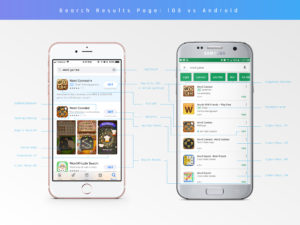
Full App Store vs Play Store ASO Diagram: Search Impression Results Page
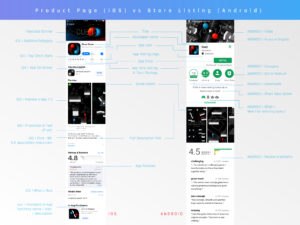
Full App Store vs Play Store ASO Diagram: Product Page (iOS) vs Store Listing (Android)
The search impression result page depicts the difference in the UX of the two stores at the keyword search-level. We can see that both stores feature paid and organic results, yet from here the two stores continue into a bifurcated UX in terms of visuals, data, and the appearance of each individual app listing.
Tip: It's also important to be aware of how Apple presents additional results into the search results page and how branded results show up in the Google Play Store search results page.
The second level in the organic app store discovery pathway does bring the road split from the search impression back together into a more cohesive path. Yet there are still significant differences to be aware of that should influence the way that app marketers approach ASO across both platforms.
Main Differences Between App Store and Play Store ASO
Here are a few summary points to keep in mind about how the differences in UX can affect ASO in the App Store vs the Play Store:
- Because videos auto-play in the App Store AND appear in the search results page, videos will have a much higher influence on conversion rate in the App Store than Play Store.
- Because screenshots also appear in the search results page, they matter more for capturing user attention in the App Store than the Play Store. Because screenshots appear below the fold in the Play Store, they do not need to be used to capture attention, and the focus should be more on education.
- While the feature graphic or video still-frame is the first visual that users see when landing on a Play Store app's store listing, these elements are preceded by the app icon, which is the first visual element that users in the Play Store see and thus has a larger overall potential to affect an app's conversion rate.
- In the App Store the icon is the only visual element that appears in a top chart or featured view (pictured in the Visual Guide to iOS 11 ASO )
- The content of user reviews matter more in the Play Store than App Store, given that Android users see keyword snippets and feature-level ratings.
- Each app listing captures a much larger percentage of the overall real estate of an App Store keyword search than in the Play Store. This can be both a good and a bad thing depending on an app's conversion strength, as each app in the App Store has a larger ability to own a user's attention, while each app in the Play Store has a larger chance to steal attention away from other apps.
- The full description is a very low element in the totem poll in both stores; however, the Play Store short description and the first 80-130 characters of an app in the App Store are seen before users must tap more, and as such play a more important role in conversion rate than any other part of the description.
- A new addition to iOS 11, promoted In-App Purchases present an opportunity to not only increase visibility, but can also affect your app's conversion rate (positively or negatively) from their position in the product page. In-App Purchases have no impact on ASO in the Play Store.
- While apps in the Google Play Store show a download range and ratings/reviews from all countries, in the search results page only the star rating shows.
- An app in the App Store shows the total ratings and star rating in the search results page, and now shows its top chart rank, if the rank is high enough; this information is segmented for the country specified in the user's settings.
That's all for now, folks! Be sure to bookmark our blog, sign up to our email newsletter for new post updates and reach out if you're interested in working with us to optimize your app's ASO or mobile marketing strategy.
Incipia is a mobile app development and marketing agency that builds and markets apps for companies, with a specialty in high-quality, stable app development and keyword-based marketing strategy, such as App Store Optimization and Apple Search Ads. For post topics, feedback or business inquiries please contact us, or send an inquiry to [email protected].
Categories
Tags:
- A/B testing
- adjust
- advertising
- adwords
- agile
- analytics
- android development
- app analytics
- app annie
- app development
- app marketing
- app promotion
- app review
- app store
- app store algorithm update
- app store optimization
- app store search ads
- appboy
- apple
- apple search ads
- appsee
- appsflyer
- apptamin
- apptweak
- aso
- aso tools
- attribution
- client management
- coming soon
- design
- development
- facebook ads
- firebase
- google play
- google play algorithm update
- google play aso
- google play console
- google play optimization
- google play store
- google play store aso
- google play store optimization
- google uac
- google universal campaigns
- idfa
- ios
- ios 11
- ios 11 aso
- ios 14
- ios development
- iot
- itunes connect
- limit ad tracking
- ltv
- mobiel marketing
- mobile action
- mobile analytics
- mobile marketing
- monetization
- mvp
- play store
- promoted iap
- promoted in app purchases
- push notifications
- SDKs
- search ads
- SEO
- skadnetwork
- splitmetrics
- startups
- swift
- tiktok
- uac
- universal app campaigns
- universal campaigns
- user retention
- ux
- ux design

