Incipia blog
Best Practices on App Icons from the Top 100 Apps
We're continuing on from two earlier studies of the top 100 app screenshots and the top 100 app descriptions, this time analyzing the trends of the top 100 App Store apps. Our goal was to uncover some actionable best practices for icon optimization. Below are our findings, along with a few additional observations and examples of icons lastly. If you have any questions, would like to see the raw data or have an idea for a future app store study, please let us know by sending an email to hello@incipia.co.
Summary Findings
- The data indicates that tasteful design tactics applied to a simplistic concept produce the best results, given that:
- Apps whose icons were just a single letter outranked other apps (simple concept).
- Apps with smaller iconography within in the icon as whole underperformed other apps (simple concept).
- Apps were rewarded for using custom design tactics, such as shadows or gradients (tasteful tactic).
- For non-game apps, icons with multi-colored backgrounds outperformed single-colored backgrounds (tasteful tactic) and apps with more than two colors outranked those with only two colors (tasteful tactic).
- Several apps tested out different icons in the App Store vs the Play Store, too. It's a good idea to use Google Play for free experimentation and learning by trying out changes; additionally, be aware that icons sometimes perform differently in each store.
![]()
The Data
![]()
- White was the most popular background color, followed by multi-colored (mostly games); but interestingly enough, a black background color correlated with a better average rank than white. When pivoted into a multi-colored vs single-colored comparison, the single-colored subset had an average rank of 50 vs 52 for multi-colored app icons; however, most multi-colored apps were games, and the five non-game apps with multi-colored backgrounds earned an average rank of 34 vs 50 for single-colored non-game apps.
![]()
- Apps which included a number or letter visual (including those such as Facebook whose icons were a single letter), ranked better (48) than those whose icons were more imaginative (53).
- The simplicity of an icon's color palette was correlated with a better average rank, as apps with two or fewer colors had a rank of 48, vs. those with color combinations of three or more (53).
![]()
- Apps whose designers provided some custom work (such as adding gradients or shadows) saw their average rank outperform those without any special design efforts (49 vs 53).
- Backing up the idea that simple is better, apps with smaller iconography within the icon itself saw a worse rank (55) than those without miniature icons (45). Narrowing the field to non-game apps saw the same trend.
- There were 15 apps whose icons were a single letter, and their average rank was better (47 vs. 51) than apps whose icons were not a single letter. Moreover, only one single letter app (Facebook) captured a top 10 rank.
![]()
- Most apps used their brand logo or some recognizable form of it, and these apps outperformed other apps whose icons alluded to the purpose of the app (though narrowly, and likely due to the fact that the branded apps had that beneficial recognition). Only three apps used non-relatable icons, but they fared poorly in terms of rank.
- We also found the top 100 iOS apps in the Google Play Store, investigating whether the same icon was used or not. A decent number of apps (16) had a noticeably different Android icon, but most differences were simply a different background, different coloring or a seasonal smaller icon, like a stocking.
Other Observations
-
Gradients were the most popular design pattern.
-
The Google suite of apps used a lot of translucent design patterns, such as the page dog ear in Google Docs.
-
Some innovative icons:
- T-Mobile used a stencil font which was interesting, yet barely visible.
- Pandora and PayPal both used pastel/translucent icons.
- Gmail had one of the best abstract visuals (the "M" is formed in an envelope).
- Many games used glowing/bright design patterns, such as Block! Hexa Puzzle.
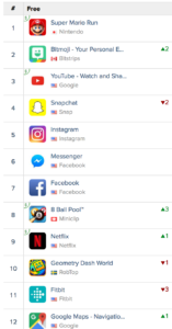
Icon Examples
- Special design pattern: Super Mario Run
- More than two colors: Bitmoji
- Just two colors: YouTube
- Multi-colored background: Instagram
- Single letter icon: Facebook
- Visual alluding to app's use case: 8 Ball Pool
- Icon includes letters/numbers: Netflix
- Smaller iconography within the icon: Google Maps
That's all for now, folks! Be sure to bookmark our blog, sign up to our email newsletter for new post updates and reach out if you're interested in working with us.
Incipia is a mobile app development and marketing agency that builds and markets apps for companies, with a specialty in high-quality, stable app development and keyword-based marketing strategy, such as App Store Optimization and Apple Search Ads. For post topics, feedback or business inquiries please contact us, or send an inquiry to hello@incipia.co.
Categories
Tags:
- A/B testing
- adjust
- advertising
- adwords
- agile
- analytics
- android development
- app analytics
- app annie
- app development
- app marketing
- app promotion
- app review
- app store
- app store algorithm update
- app store optimization
- app store search ads
- appboy
- apple
- apple search ads
- appsee
- appsflyer
- apptamin
- apptweak
- aso
- aso tools
- attribution
- client management
- coming soon
- design
- development
- facebook ads
- firebase
- google play
- google play algorithm update
- google play aso
- google play console
- google play optimization
- google play store
- google play store aso
- google play store optimization
- google uac
- google universal campaigns
- idfa
- ios
- ios 11
- ios 11 aso
- ios 14
- ios development
- iot
- itunes connect
- limit ad tracking
- ltv
- mobiel marketing
- mobile action
- mobile analytics
- mobile marketing
- monetization
- mvp
- play store
- promoted iap
- promoted in app purchases
- push notifications
- SDKs
- search ads
- SEO
- skadnetwork
- splitmetrics
- startups
- swift
- tiktok
- uac
- universal app campaigns
- universal campaigns
- user retention
- ux
- ux design